Legacy Maemo 5 Documentation/Human Interface Guidelines/Controls
Contents |
Controls
Using Controls Effectively
Although many GTK widgets are used similarly to how widgets are used within Hildon, some of them widgets require special attention. Likewise, there are several Hildon-specific widgets that are specially designed for mobile devices with touch screens.
Refraining from altering a widget's default behavior is important. Developers should attempt to provide users with a standardized set of tools so that applications are as efficient and intuitive as possible. Controls that behave in atypical ways can destroy a user's mental model of how an application works. Introducing new concepts dilute the meaning of a standardized visual language.
Text Entry Fields
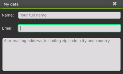
Text Entry Fields are used for entering one or more lines of plain text. "HildonEntry" can be used for a single-line text input and "HildonTextView" can be used for multi-line text input.
Figure 10: Text input widgets
Guidelines
- When the user changes focus to a Text Entry Field via the device's keyboard, the existing text must be highlighted, with the cursor placed at the end of the text. This action should not overwrite or delete the existing "primary" clipboard selection. Doing this will make it easier to immediately over-type or append new text to the selection, the two most common operations performed in Text Entry Fields.
- Try to size Text Entry Fields according to the most likely size of the input. This gives a useful visual cue to the amount of input expected and breaks up the dialog, making it easier to scan. Be diligent in designing the fields according to the expected input -- all of the fields in a dialog don't need to be the same width just because it looks nice.
- Lastly, validate the contents of each Text Entry Field either when it loses focus or when the window is closed, not after each keypress.
=Behavior of Tab key
The behavior of the Tab key in Hildon differs from what one might expect in a traditional desktop application. Since no widgets -- apart from Text Entry Fields and Text Views -- can have focus, the Tab key will only set and/or change focus when those text widgets are present in the interface. Otherwise, by default, the Tab key shouldn't do anything.
Touch Selectors
Touch Selectors are a set of widgets within Hildon that allow users to select one or several items from a list. Consider an application that requires users to select their favorite fruits from a list. A Touch Selector should be used for this task. While there are similar widgets for use with GTK, it is advised that Touch Selectors be used.
=Touch Selector Entry
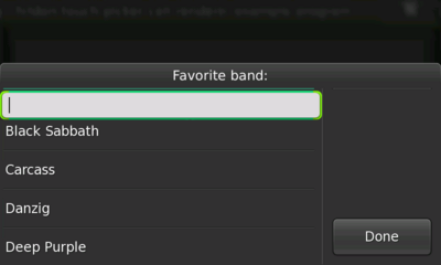
A Touch Selector Entry is a special kind of selector that, apart from the normal Touch Selector functionality, also has a Text Entry Field at the top of the Touch Selector list. This widget can be used in applications where users are asked to provide information that is saved to the Touch Selector Entry list in real-time for future use.
Figure 11: Touch selector entry
A good example of this functionality is an application that asks users to provide a number that occurs within a certain range. The application can list the most common choices, but still allow users to enter additional numbers in the Touch Selector Entry field (which, of course, would need validation afterward).
Picker Button
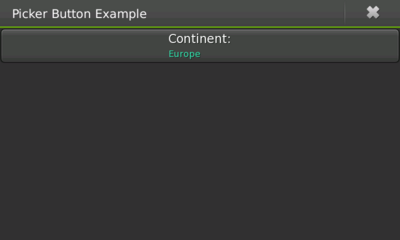
Picker Buttons are the method in which a Touch Selector is used. When users press a Picker button, the assigned Touch Selector is shown so that various options may be chosen. When an option is chosen, the Picker Button will hold the text returned from the Touch Select Print function as its value.
Generally, any group of options from which users must choose will be presented using a Picker Button.
Figure 12: Picker button
Date Selector
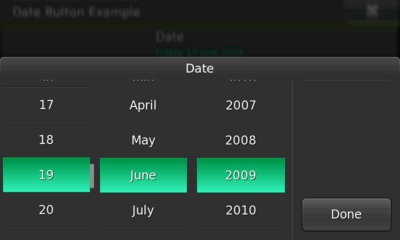
Date Selectors are Touch Selectors that provide an easy way for users to pick a date.
Figure 13: Date selector
Guidelines
- Assign the initial date of the Date Selector appropriately. In other words, if a date is supposed to represent a future event then the initial date should be set to either the current day or the day after. On the other hand, if a birth date is required then the initial date should be set to January 1st of the year previous to the current year.
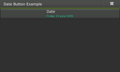
Date Button
Date Buttons work similarly to Picker Buttons, but should be used instead of the general Touch Selectors.
Figure 14: Date button
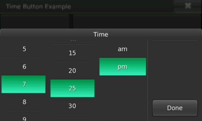
Time Selector
As with Date Selectors, Time Selectors are Touch Selectors but they target the selection of time (hour, minute, and second, as well as AM/PM format depending on the 12/24 hour settings).
Figure 15: Time selector
Guidelines
- As mentioned with Date Selectors, the Time Selector's initial time should be set taking its purpose and context into account. For example, if an application asks for a date and time of a future event, and the date was already entered -- in this case, today's date -- then the Time Selector's initial value should be set to a time later than the current time.
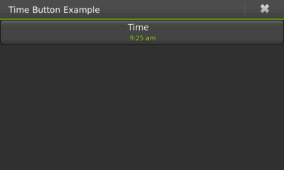
Time Button
Time Buttons launch a Time Selector when pressed, and are the most common method for accessing a Time Selector.
Figure 16: Time button
Toolbars
Whenever possible, the use of regular (i.e., traditional desktop application) Toolbars in a Hildon application should be avoided. Fixed widgets such as these waste too much precious space.
Often times, Toolbars contain controls that will perform the same actions as menu items or buttons. Because of this, developers must consider where else these particular actions can be performed within the application. For example, text editors often use the buttons "New," "Open," and "Save" in their Toolbars. But, these actions already exist within the application's menu.
If certain actions are present within a Toolbar, but are not available anywhere else within an application, consider creating new menu items that are accessible via a sub view. But, if some Toolbar actions are integral to using an application (e.g., email applications rely on the "New Message" action), they should be placed in the application's main contents. In the case of an email application, the "New Message" button should be placed at the top of the application's list of messages.
Unorthodox Use of Toolbars
Although Toolbars should be avoided, there are special cases where they can come handy without compromising an application's usability. For example, in an image editing application where images fill the entire screen, a Toolbar could be used to provide quick access to a number of useful editing tools.
Special Toolbars
Hildon provides special Toolbars that target specific needs: the Find Toolbar and the Edit Toolbar.
Find Toolbar
The Find Toolbar presents user with a familiar way to search for content: a text entry field with a dropdown list that contains any previously entered search terms. Applications should use this Toolbar instead of implementing a custom search interface.
Applications should use this toolbar for search instead of having their own individual search interface.
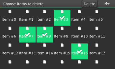
Edit Toolbar
The Edit Toolbar allows users to perform actions on previously edited items. For example, the Edit Toolbar allows users to delete a selected group of items by choosing Delete from the Edit Toolbar. The Toolbar's buttons should display labels describing exactly what each button will do (e.g., "Delete").
Figure 17: Edit toolbar
Buttons
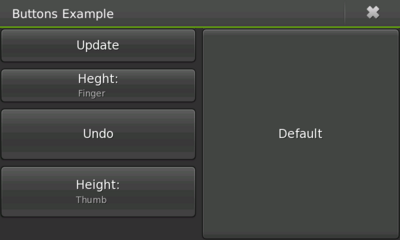
Hildon allows the use of either classic GTK buttons or Hildon buttons. Hildon buttons have a title and value instead of just a label. The title appears on the top of the button, with the value at the bottom. If using GTK buttons, developers should implement finger-optimized sizes. Hildon buttons, on the other hand, are usually set to "finger" or "thumb" heights.
Figure 18: Buttons
Guidelines
- Label all buttons with imperative verbs, using "Title Capitalization" (e.g., Save, Sort, Update Now, etc.).
- After pressing a button, results of the action should occur within 1 second (e.g., closing a window or opening another).
- Invalid buttons should be disabled. Error messages should not be applicable for buttons that cannot be clicked.
Check Buttons
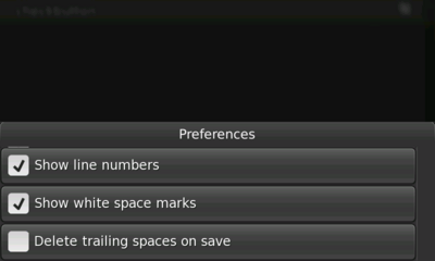
Check Buttons are very similar to the GTK's Check Boxes, although they appear in the form of buttons rather than boxes. Check Buttons are used to represent two states of a given property (e.g., "on" and "off"). Below are some guidelines taken and adapted from the GNOME HIG's Check Boxes Section.
Figure 19: Check buttons
Guidelines
- Do not initiate an action when a Check Button is pressed.
- Pressing a Check Button should not affect the values of any other controls. However, they may enable, disable, hide, or show other controls.
- If toggling a Check Button affects the functionality of other controls, place the Check Button immediately above, or to the left, of the control(s) that it affects. This helps to indicate that the controls are dependent on the state of the Check Button.
- Use sentence capitalization for Check Button labels (e.g., Use custom font).
- Label Check Buttons so that they clearly indicate the effects of both their checked and unchecked states (e.g., Show icons in menus). If the effects of a Check Button are difficult to discern, consider using two Radio Buttons instead so that labels can be given to each state.
- Label each group of Check Buttons with a descriptive heading above or to the left of the group.
- Do not place more than four Check Buttons (if each button is finger-height) or three Check Buttons (if each button is thumb-height) under the same group heading. If more Check Buttons are required, consider using a Touch Selector with multiple selection enabled.
Toggle Buttons
Toggle Buttons look similar to regular #Buttons, but are used to show or change a state rather than initiate an action. Toggle Buttons have two states: set and unset. These states are shown by the button appearing "pushed in" or "popped out" respectively.
Toggle Buttons should only be used as filters in a View Menu. Outside the View Menu, Picker Buttons should be used (if not contained in a View Menu, Toggle Buttons can be confusing since they look like regular buttons).
When using multiple Toggle Buttons within a View Menu, they should be grouped. This makes it easier for users to understand that each button represents one out of several available options. Also note that Toggle Buttons are, in fact, GTK buttons. Because of this, they do not support certain Hildon attributes, luke like title and value.
Guidelines
- Only use Toggle Buttons as filters within a View Menu.
- Display multiple Toggle Buttons in groups, so they are not mistaken for regular buttons. These groups should either behave like a group of Check Buttons or a group of GTK radio buttons, depending on the need.
- Use the same text or graphical label for a Toggle Button whether it is set or unset.
Notebooks
The typical use of a tabbed Notebook is not advised in Hildon. Sub views should be used instead. Notebooks should only be used within a Hildon application when assigned to a Wizard.
Progress Indicator
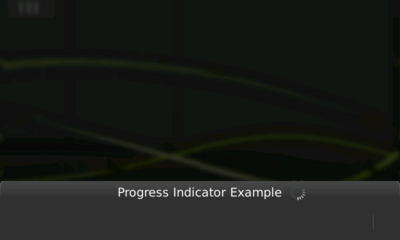
Sometimes, it is necessary to show users that an application is performing a task that requires some wait-time. This is done by assigning a Progress Indicator to the dialog. A Progress Indicator is a non-intrusive spinning icon that is placed in a dialog's title to give an immediate feeling that an operation is being processed.
Figure 20: Progress indicator
Guidelines
- Avoid the use of traditional progress bars. Instead use the Progress Indicator.
- When the Progress Indicator is in action on a dialog, the dialog should not display any additional usable content (i.e., all that should be displayed is static informative or no content at all).
- For operations that could take some time, also consider displaying a banner once the operation begins. Doing this will remind users that the task has started (e.g., "Downloading messages"). This kind of banner should have a standard timeout and should not remain onscreen for the entire duration of the operation.
- Process updates (i.e., various steps during an operation) should be displayed within banners. Use simple and short descriptions for the steps (e.g., "Authenticating," "Downloading," "Closing connection," rather than, "Authenticating user in the server," "Downloading all messages from server," or, "Shutting down the connection with the server").
- If some widgets that are present in the dialog are related to each step of a running operation, do not show them after the step. Show all of them after the application is complete.
Sliders
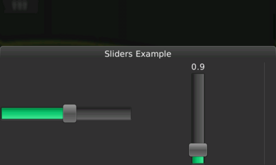
In Hildon, a GtkVScale or GtkHScale will return a vertical or horizontal finger-usable slider, respectively. This widget should follow the same guidelines that are advised in the GNOME HIG, in the Sliders section.
Figure 21: Sliders figure

