Task:Improving the Application manager
(→Application list) |
(→Category view) |
||
| Line 3: | Line 3: | ||
== Category view == | == Category view == | ||
I was having a discussion with X-Fade today on the repository category mess, and the possibility of having usable categories besides "All" (sadly, I haven't even looked at anything but "All" since at least OS2005 :\) made me consider some of the issues with the current category setup in Application manager. | I was having a discussion with X-Fade today on the repository category mess, and the possibility of having usable categories besides "All" (sadly, I haven't even looked at anything but "All" since at least OS2005 :\) made me consider some of the issues with the current category setup in Application manager. | ||
| + | |||
| + | [[Image:Application manager column-view mockup.jpg|400px]] | ||
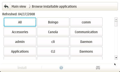
The current category view has an awful lot of wasted whitespace. My initial reaction here was that a grid view in place of a the current list-view would make better use of space and improve the thumb-ability (ordering is badly messed-up in my mock-up—it should be left-to-right rather than top-to-bottom). The number of packages in each category should be noted parenthetically for each category (shown in the tree-view mock-up). | The current category view has an awful lot of wasted whitespace. My initial reaction here was that a grid view in place of a the current list-view would make better use of space and improve the thumb-ability (ordering is badly messed-up in my mock-up—it should be left-to-right rather than top-to-bottom). The number of packages in each category should be noted parenthetically for each category (shown in the tree-view mock-up). | ||
| + | |||
| + | [[Image:Application manager grid-view mockup.jpg|400px]] | ||
The grid-view is probably the most straightforward and immediate solution, but some extra options wouldn't hurt. Some sort of tree view (while mildly ungainly) could give a nice overview alternative to "All" while reducing the number of screens the user needs to click through. Show all the categories as collapsible branches, and indicate the number of packages in each category parenthetically. | The grid-view is probably the most straightforward and immediate solution, but some extra options wouldn't hurt. Some sort of tree view (while mildly ungainly) could give a nice overview alternative to "All" while reducing the number of screens the user needs to click through. Show all the categories as collapsible branches, and indicate the number of packages in each category parenthetically. | ||
| + | |||
| + | [[Image:Application manager tree-view mockup.jpg|400px]] | ||
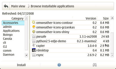
Finally a column view could be another useful alternative for reducing the number of screens to click through and providing a better overview. Put a column of categories on the left (again, with the number of packages in each category indicated parenthetically) and display the packages in that category in the right column. | Finally a column view could be another useful alternative for reducing the number of screens to click through and providing a better overview. Put a column of categories on the left (again, with the number of packages in each category indicated parenthetically) and display the packages in that category in the right column. | ||
Revision as of 15:47, 19 June 2008
As one of the foremost application's in a new user's experience of Maemo, Application manager needs to be one of the platform's best (perhaps only superceded by the browser and email client). As it stands, though, it is still in need of improvement in a lot of areas.
Contents |
Category view
I was having a discussion with X-Fade today on the repository category mess, and the possibility of having usable categories besides "All" (sadly, I haven't even looked at anything but "All" since at least OS2005 :\) made me consider some of the issues with the current category setup in Application manager.
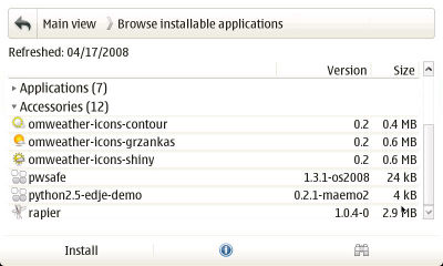
The current category view has an awful lot of wasted whitespace. My initial reaction here was that a grid view in place of a the current list-view would make better use of space and improve the thumb-ability (ordering is badly messed-up in my mock-up—it should be left-to-right rather than top-to-bottom). The number of packages in each category should be noted parenthetically for each category (shown in the tree-view mock-up).
The grid-view is probably the most straightforward and immediate solution, but some extra options wouldn't hurt. Some sort of tree view (while mildly ungainly) could give a nice overview alternative to "All" while reducing the number of screens the user needs to click through. Show all the categories as collapsible branches, and indicate the number of packages in each category parenthetically.
Finally a column view could be another useful alternative for reducing the number of screens to click through and providing a better overview. Put a column of categories on the left (again, with the number of packages in each category indicated parenthetically) and display the packages in that category in the right column.
Application list
The application list is where most of the user's time will be spent—browsing and installing
Info dialog
Most of what the information dialog suffers from is a bad case of the scrollies. Almost all of the time every tab of this dialog has a horizontal scrollbar. This should really never happen for a native widget, especially since pratically all of the information being displayed could be intelligently soft-wrapped.
Summary
Description
Installing/Uninstalling/Upgrading
This tab is a particularly bad offender, as the content is pretty much a known value.


