Legacy Maemo 5 Documentation/Human Interface Guidelines/View Menu
(→What if more menus are needed?) |
danielwilms (Talk | contribs) (→View Menu) |
||
| Line 1: | Line 1: | ||
=View Menu= | =View Menu= | ||
| - | The | + | The view menu follows a very different approach from the traditional application menus. There is no menu bar, the view menu is activated when the user presses the application's title area. |
| - | The | + | The view menu can hold until ten menus at most divided in two columns - or one column in portrait orientation. It can also include filters. The menu items are in fact buttons and there are no sub menus. |
[[Image:view_menu.png|400px]] | [[Image:view_menu.png|400px]] | ||
| Line 9: | Line 9: | ||
| - | + | Menus that perform similar actions, for example "Previous" and "Next" (like in figure 8), should be placed side by side. The most important menus should be placed on the top of the view. | |
| - | |||
| - | The | + | Actions that are available from another place in the application (either in the interface or from a hardware key) shouldn't be repeated by a menu. |
| + | |||
| + | The view menu should be different according to the current view. For example, is a user is the the "Inbox" sub view of an email application, he should access the view menu of the "Inbox" and not the view menu of the root view. | ||
| + | |||
==What if more menus are needed?== | ==What if more menus are needed?== | ||
Revision as of 11:21, 17 August 2009
Contents |
View Menu
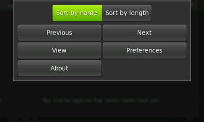
The view menu follows a very different approach from the traditional application menus. There is no menu bar, the view menu is activated when the user presses the application's title area.
The view menu can hold until ten menus at most divided in two columns - or one column in portrait orientation. It can also include filters. The menu items are in fact buttons and there are no sub menus.
Figure 8: A view menu
Menus that perform similar actions, for example "Previous" and "Next" (like in figure 8), should be placed side by side. The most important menus should be placed on the top of the view.
Actions that are available from another place in the application (either in the interface or from a hardware key) shouldn't be repeated by a menu.
The view menu should be different according to the current view. For example, is a user is the the "Inbox" sub view of an email application, he should access the view menu of the "Inbox" and not the view menu of the root view.
What if more menus are needed?
Following the principles stated in section 1.8, "Hildonizing an Interface," it is possible to keep the interface simple yet functional.
Any use of sub menus, beyond what fits in the 10 menu item slots in the View menu, should be avoided. Even just removing those menu commands that do not fit, should be considered.
The fallback way to support additional menu items (in corner cases) is to have an menu item in the view menu that opens a dialog. That dialog has the action area removed, and contains a dialog wide grid of command buttons in two columns. Visually this is quite similar to the view menu itself.
The less menu items, the better. This is important not only because there are a limited number of items allowed within Hildon, but also because it is good practice to limit the amount of menu items a user is forced to navigate through in order to achieve a particular action. Again, if an action can be already performed by some other widget within the application's interface, do not include a menu item for it.
Filters
Along with typical menu items, filters can also be used within a View Menu. Filters are toggle buttons that can be used for presentation/sorting purposes. For example, sorting a list of contacts alphabetically, or changing the size of icons in a list.
As a general rule, these actions shouldn't change the amount of data displayed, just how that data is displayed.
Filters should always be presented in groups. Because of this, there should always be at least two menu filters (e.g., a menu filter that will sort a list of email messages alphabetically and one that will sort them by date -- not just one filter for alphabetical sorting).
Menu Keyboard Shortcuts
Sometimes it makes sense to add keyboard shortcuts to some actions that can also be performed via the View Menu.
If the shortcut will perform a common action like creating something new, formatting the text as bold, or undoing a previous action, take care in utilizing common shortcuts that are generally used in other applications. For example, the previous mentioned actions would be Ctrl+n, Ctrl+b, and Ctrl+z, respectively.
Unavailable Menu Items
Even though it is a common and useful practice in desktop applications to make certain menu items unavailable (i.e., "dimmed"), when their actions are not available, Hildon takes a different approach: the menu items should not be visible at all. Although dimmed menu items suggest actions that are unavailable, they can cramp menu space on the small screen and make interaction with available menu items more confusing.
Figure 9: An incorrect view menu


