Legacy Maemo 5 Documentation/Human Interface Guidelines
(→Windows) |
(→Windows) |
||
| Line 44: | Line 44: | ||
System notifications, error messages and progress indicators are only displayed in the landscape orientation. In portrait orientation mode, only incoming calls notifications are displayed on the screen; other notifications are indicated by sound, vibration, or LED. | System notifications, error messages and progress indicators are only displayed in the landscape orientation. In portrait orientation mode, only incoming calls notifications are displayed on the screen; other notifications are indicated by sound, vibration, or LED. | ||
| + | |||
==Windows== | ==Windows== | ||
Revision as of 18:56, 13 July 2009
Hildon Human Interface Guidelines
Introduction
This topic presents a series of guidelines to help you create Hildon applications that provide a good user experience. The principles and advices covered here are intended to help interface designers, software developers and graphic artists to create well-designed and intuitive tools fully adapted to mobile devices, considering their capabilities and limitations.
Following these guidelines, your work will result in an application which is attractive and simple to use. Also, you can expect that:
- Users will learn to use your application faster, because interface elements will look and behave the way they are used to.
- Novice and advanced users will be able accomplish tasks quickly and easily, because the interface won't be confusing or make things difficult.
- Your application will continue to look good when users change color themes, fonts and languages.
- Your application will be designed with usability in mind, specially adapted to mobile devices with a limited screen and input methods.
To help you achieve these goals, these guidelines will cover the basic interface elements, how to use them together effectively, and how to integrate well with the specificities of mobile devices.
Since the GNOME plaform forms the basis of Hildon, this document is based on the GNOME Human Interface Guidelines. They have been adapted for developing software for a mobile platform. Some sections of the GNOME HIG will be referenced and linked directly, since they are particularly relevant. We also recommend readong the GNOME HIG entirely, as it contains a lot of generally useful interface design advice.
Usability Principles
This section outlines some basic principles that are core to the development of touch interfaces and mobile applications. Concepts introduced later in this document build upon the principles in this section. Although the Principles Section of GNOME HIG is not directly related to mobile applications, it is a very useful reference, and the reader should be familiar with it as well.
Diversity
Mobile devices have a wide variety of available hardware. For example, some devices have special buttons to raise the volume, to call a menu, to navigate through the menus, etc. Other devices might not have any of these buttons. Because of this diversity, avoid using icons or actions that are intimately related to a specific device or brand. For example, don't use a mouse icon with a button highlighted to suggest a user "click". Also, avoid messages that mention specific hardware features, such as "Use the menu button to..." (unless referring to a graphical button). The developer only controls the software's user interface and cannot depend on any particular hardware features.
Size Matters
Screen size
A mobile device is neither a desktop nor a laptop computer. Screen size is an obvious and important difference. Interacting with an application on the small screen of a mobile device is a very different experience than working with a standard computer screen.
Remember that mobile device screens are not only small, but they vary widely in size and dimensions. Do not assume that your user's device will have the same size screen as the one you are using. Some devices may have a landscape display while others will have a portrait display. Some may even be able to change the display orientation. Mobile applications must be able to adapt to all these displays. Fixed-sized application widgets should be avoided. For example, instead of defining a fixed size for a button, let Hildon adapt that button to the label and screen layout.
Widget size
Hildon is designed for touch interfaces. If you wish your application to be finger-friendly, be aware of the size of the widgets with which the user will interact. Small touch areas, such as small buttons, are difficult and frustrating to use.
Using Fingers
Since Hildon was designed to be a finger-centric interface, consideration of the end-user must be used when deciding on the placement of widgets within applications. For example, imagine an application that is divided into two columns: the left column for displaying information and the right column for various control widgets. In this case, a left-handed user may be forced to obscure part of the display area with their fingers when touching the control widgets with their left hand. Because of this, it is good practice to allow the user choose their preferred column positions.
Device Orientation
Hildon is optimized for full functionality in the landscape screen orientation. Although both orientations are supported, framework level functionalities such as the status bar, back/close, are not available on the portrait mode.
The switch between orientation modes can be done by the Hildon framework transparently for the application developer. The only relevant decisions for application developers are whether to request the portrait orientation mode and which interface elements to use on it.
The portrait mode is intended for simplified, one-handed use and functionality may, and should, be limited in this orientation. For example, a Now Playing message for a media application, a read view for a PDF reading application, or simplified call handle controls.
System notifications, error messages and progress indicators are only displayed in the landscape orientation. In portrait orientation mode, only incoming calls notifications are displayed on the screen; other notifications are indicated by sound, vibration, or LED.
Windows
The construction, organization, and behaviour of windows within Hildon are quite different than those found in traditional desktop applications. For example, users cannot drag or move windows in Hildon.
This section covers some of these differences by describing the properties and organization of certain types of windows (e.g., wizard dialogs).
Window Views
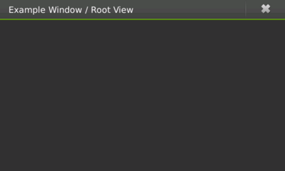
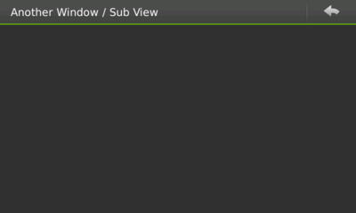
In Hildon, the concept of window organization is very important to developing a highly usable application. In a traditional desktop application, it is normal that a function in one window might bring up another window -- which can then bring up a third one, etc. In Hildon, a new concept called "window views" is introduced. Windows views just means that there is a stack of windows, users only seeing the top-most window. Application can have several window views describing various tasks. Window views can be broken down into "root view" (the application's main window, figure1), on top of which "sub views" (figure 2) are created (e.g., writing or forwarding an email, choosing from a list of contacts, searching emails, etc.).
Figure 1: A root window Image rootview
Many activities in an application should be presented and performed in subviews. After interacting with sub views, users can press the back button to return to the root view.
Figure 2: A sub view Image subview
Because of this new methodology, "split" or "tree" views should never be used. Instead, each area that might have been split, should be moved to a new sub view in the window stack. As an example, consider an email application. The root view would present the user with a list of options he can choose like "Inbox," "Outbox," "Drafts," etc. If the user chooses "Inbox," a new sub view window is displayed with a list of messages in the user's Inbox. Clicking on a message from the list would then bring in a new sub view window containing the message content.
Always provide the user with the proper navigation in order to move between the open window views within the stack.
Note that it is important to choose when an action on an element in a window of a stack will either initialize a new sub view or a full independent window. Normally, new tasks that interrupt the typical flow of actions are likely to require a new independent window and not a new sub view. For example, when browsing a to do list, the action of creating a new to do item should be an individual window and not a sub view.
Properties of Windows
Titles
Every window should have a title. Although, given the small screen dimensions, a window title should neither be long nor contain unnecessary information. For example, do not include the program's version number in the title text.
Since only one window is shown at a time, it is quite easy for users to identify which application a visible window belongs to. Because of this, repeating an application's name in every window title is not required. In fact, doing so could even make the user's experience more complicated than it needs to be.
Sizes
When applications are in normal mode (not in full-screen mode), its main window should always occupy the maximum allowable size (i.e., the same size as the desktop, minus the top of the screen, where framework-specific information is displayed).
Window Modes
An application's window can either be displayed in normal or full-screen mode depending on application type and availability of modes.
Notes and Banners
Notes or Banners should be used when it is necessary to present users with application-specific information or to ask for some kind of confirmation.
Because these widgets interrupt the natural flow of most application interactions, they should be used sparingly and only when crucial to a specific function of the application.
While banners do not require any user interaction in order to be dismissed, notes always need one.
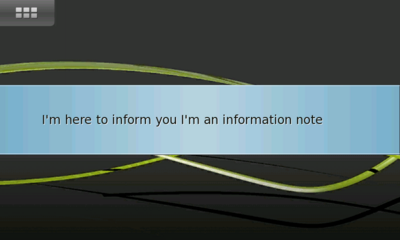
Information Notes
Information notes are modal dialogs that display information, but have no buttons -- simply pressing anywhere on the screen will make the note disappear.
Figure 3: An information note Image information_note
This kind of a note should only be used when immediate attention is required (information that users must read). For example, if an application is performing an important task that requires user input in order to complete the task.
Information Notes should only be used when necessary, as there are other, less obtrusive ways to interact with users.
Confirmation Notes
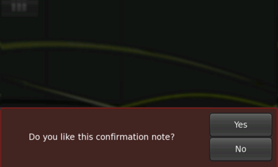
Confirmation Notes are modal dialogs with two or more options available to the user. Confirmation Notes can be viewed as the Hildon equivalent to GTK's alert dialogs.
Figure 4: An confirmation note Image confirmation_note
These notes should be used when the application is about to perform a task that might lead to an unintended action like destroying data, compromising security, or requiring inordinate processing time. Unlike Information Notes, Confirmation Notes only disappear after a user's response, that is, they won't go away until the user presses one of the note's buttons.
Use Confirmation Notes in moderation and consider making their frequency user-configurable in the application's Preferences dialog (i.e., allow users to turn off features like confirming to quit the application, etc).
Note Buttons
In most cases, Confirmation Notes should only ask "Yes" or "No" questions where the text on the buttons is "Yes" and "No." Also, assure that button ordering is consistent across your application. Don't set the "Yes" button as the first button in one Confirmation Note but as the second button in other notes.
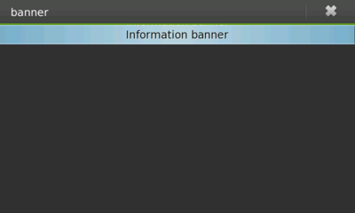
Banner
Banners are used to display information for a specified duration. This type of notification should be used to display non-critical information (that a certain task is complete, or that an application state has changed, etc.).
The period of time that a banner will stay onscreen can be adjusted. However, the duration should not be excessive, as it is an intrusive method for displaying information.
Figure 5: An banner Image banner
Banners should be distinguished from the system's own banners, that is, they should suggest to the user which application they belong to. This can be done by displaying the application's name or by making it clear in the message's text.
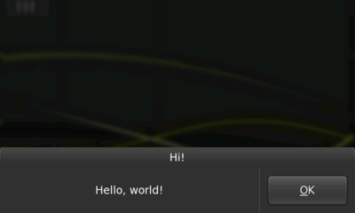
Dialogs
Although derived from GtkDialog, Hildon dialogs behave differently than in a traditional desktop environment. To make them more usable, dialogs are placed at the bottom of the screen, with their buttons on the right side. Dialogs can be closed by pressing on the dimmed desktop background outside of the dialog itself.
The number of dialog buttons should be kept to a minimum. Dialogs should not have a "close" or "cancel" button, since that task is accomplished by pressing the dimmed area outside of the dialog.
Dialogs should be used for quick tasks. For example, a dialog is appropriate for asking for a category name when creating a new category in an email application. In this example, there should be a Text Entry Field for users to enter the category name and a single button, "Create."
Figure 6: An dialog Image dialog
For other tasks such as browsing through email messages, deleting or editing them, or managing an email account folder, a sub view should be used instead of a dialog.
Wizard Dialogs
A Wizard is a dialog that divides a task into sequential steps. With this special-case dialog, a complex operation can be presented more simply to users. Therefore, do not use a Wizard unless you are sure it will simplify an action for the user. For example, in a situation where users must set a simple preference, a normal dialog should be enough. But, if users must complete a number of settings which are dependent on sequential input before the application will function properly, then the use of a Wizard is appropriate.
The first page of a Wizard is a "welcome page." Its title should be the Wizard's name followed by, "Welcome." Similarly, the title of the Wizard's last page is a the Wizard's name combined with, "Finished." The titles of intermediate pages should be a combination of the Wizard's name and the action to be completed on the page. The page's action is set in the Wizard's assigned Notebook.
Figure 7: An wizard dialog Image wizard
Wizard dialogs contain three buttons: Finish, Previous, and Next. These buttons are automatically dimmed or undimmed according to the current page of the Wizard.
Since the first page is the welcome page, it should not require any user input, other than navigation buttons. Instead the page should tell the user what the Wizard is for. This information should describe what to expect from the Wizard, the steps that will follow, as well as what will happen once the Wizard is complete. The last page should summarise important choices made by the user as well as describe what will happen when the "Finish" button is pressed. Avoid asking for important choices on the last page of a Wizard (although simple choices, such as showing a README file, may be included). All important choices to be made, including data that users are required to enter, should be requested on the intermediate pages of the Wizard. Likewise, always explain (via labels and captions) the reason for the requested information or choices.
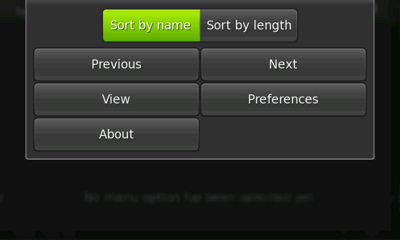
View Menu
The view menu follows a very different approach from the traditional application menus. There is no menu bar, the view menu is activated when the user presses the application's title area.
The view menu can hold until ten menus at most divided in two columns - or one column in portrait orientation. It can also include filters. The menu items are in fact buttons and there are no sub menus.
Figure 8: An view menu Image view_menu
Menus that perform similar actions, for example "Previous" and "Next" (like in figure 8), should be placed side by side. The most important menus should be placed on the top of the view.
Actions that are available from another place in the application (either in the interface or from a hardware key) shouldn't be repeated by a menu.
The view menu should be different according to the current view. For example, is a user is the the "Inbox" sub view of an email application, he should access the view menu of the "Inbox" and not the view menu of the root view.
What if more menus are needed?
Following the principles stated in section 6 it is possible to keep the interface simple yet functional.
If some actions that could perfectly fit in a sub menu in a desktop application do not fit in a view menu, consider creating a new sub view that will contain the commands that don't fit in the view menu.
For example, consider a text application that should have a "Format" menu with several sub menus: "Comment Lines", "Remove Lines", "Duplicate Lines", etc. Such is not supported by a Hildon menu, however, a new sub view can be created that will hold buttons to perform the actions intended to be sub menus of "Format". That sub view appears when the user presses the "Format" menu.
Remember, keep the number of menu items low, add only useful ones. The less menu items, the better. This is important not only due to the limited number of items that a Hildon menu supports but also because of not forcing the user to navigate through a large number of views in order to get the wanted functionality. If a menu item's action can be already performed by some other widget in the interface, do not include a menu for it.
Filters
Apart from the menu buttons, filters can also be used. Filters are toggle buttons that can used for presentation/sorting purposes. For example, sorting alphabetically a list of contacts or changing the size of icons in a list.
As a general rule, these actions shouldn't change the amount of data displayed, just how that data is presented.
Filters should be presented in groups. For example, if the menu should allow the user to sort a list of messages alphabetically, the filters present should be at least a "sort alphabetically" filter and a "sort by date".
Menu Keyboard Shortcuts
Sometimes it makes sense to add keyboard shortcuts to some actions that can be performed from the menu.
If the shortcut will perform a common action like creating something new, format the text as bold or undo, key combinations from generally known applications should be used, independent from the user's language. For example, the previous mentioned actions would be Ctrl+n, Ctrl+b and Ctrl+z, respectively.
Menu Items Sensitiveness
Even though it is a common and useful practice to make menus items insensitive on a desktop application when their actions are not available, on Hildon they should instead be made invisible.
Figure 9: An wrong view menu Image view_menu_wrong
Although dimmed menus items suggest the user that an action is not available, will clutter the menu and make it more confusing for users to choose what they want. Figure 9 shows an example of a wrong view menu since the last menu item is dimmed and not invisible.
Hildonizing an Interface
Although HIG is not a guide about migrating a desktop application to its mobile version, this section talks a little about this because often people think about desktop applications when designing interfaces for mobile devices. This leads to common mistakes that compromise the usability of an application. With a limited working area, mobile devices' screens cannot support all the types of widgets that a desktop computer application normally supports
When developing an application for a mobile device, you must not think of it as a direct translation of one platform to another but rather as an adaption of ways to accomplish the same tasks. Cases that express this adaption are present all over this document but this section takes special look at them.
By following the principles covered in this section, your application will end up simpler to use and a easier to learn by the user.
Divide and Conquer
The way to simplify the interface but still have full functionality in a Hildon application is to divide the content. The limited screen size make it difficult to include and use a large number of controls in the screen at the same time, so, the solution is not to have them together.
For example, consider an email client application that usually has a split view containing on one side a tree view with a list of accounts and respective folders and on the other side a view of a list of messages within the currently selected folder. This is obviously too much for a small size screen and the solution is to divide the contents. So, a first view should display the available accounts for the user to choose one. After the account is chosen, a new view should display the different folders ("Inbox", "Outbox", "Drafts", etc.). Choosing a folder, would bring up a new view with the list of messages in it.
Keep in mind that the division should be well balanced in the way that things shouldn't be divided to a point where the user needs to navigate a number of views to do obvious things. For example, in the list of messages in the "Inbox" it is likely that next steps for the user are to open a message, delete a message, or create a new one. Hence, a button "Create Message" could be added to the same view where the message list is.
Do Not Repeat Yourself
Several desktop applications have repeated functionality for many tasks. For example, one may edit a message from a message list by using the Edit menu from the menubar, by using the popup menu from the mouse right button or even by using the toolbar. In Hildon, in order to simplify and save space for the sake of usability, a task should not be repeated. If the user can create a new message by pressing a button in the interface, then do not add a "Create New Message" menu item.
Controls
Using Controls Effectively
Although a good number of GTK+ widgets can be used the same way in Hildon as they are with GTK+, some of them require special attention. Apart from that, there are several widgets that are related only to Hildon and were specially designed for mobile devices with touch screens.
Not altering the widgets standard behavior is important. This allows users to predict the effects of their actions, and thus learn to use your application more quickly and efficiently. Controls that behave in non-standard ways break the user's mental model of how your application works, and dilute the meaning of the interface's visual language.
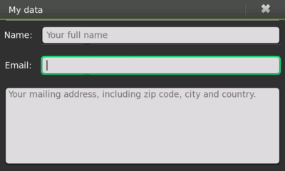
Text Entry Fields
Text entry fields are used for entering one or more lines of plain text. Use a HildonEntry for a single-line text input or HildonTextView if you need a multi-line text input.
Figure 10: Text input widgets Image text_widgets
Guidelines
- When the user gives focus to an entry field using the keyboard, place the text cursor at the end of the existing text and highlight its contents (but don't overwrite/delete the existing PRIMARY clipboard selection). This makes it easy to immediately overtype or append new text, the two most common operations performed on entry fields.
- Size text entry fields according to the likely size of the input. This gives a useful visual cue to the amount of input expected, and breaks up the dialog making it easier to scan. Don't make all the fields in the dialog the same width just to make everything line up nicely.
- In a dialog for example, validate the contents of the entry field when it loses focus or when the window is closed, not after each keypress.
Behavior of Tab key
The behavior of the Tab key in Hildon differs from what a user might be used in a desktop application. Since no widgets apart from the Text Entry and Text View can have focus, the Tab key will only set/change focus if any of the text widgets is present, otherwise, by default it won't do anything.
Touch Selectors
Touch Selectors are a set of widgets introduced by Hildon that allow a user to select one or several items from a list.
You can use a Touch Selector to achieve similar functionalities that you would do with GTK+ widgets that are not advised to be used for mobile devices.
For example, consider an application that needs the user to select a favorite fruit from a list. A touch selector can be used for this task.
Touch Selector Entry
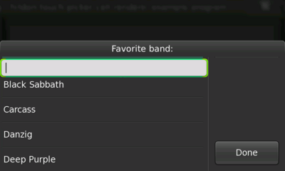
A Touch Selector Entry is a special kind of selector that apart from the normal touch selector functionality will also have a text entry on top of the list (see figure 11).
Figure 11: Touch selector entry Image touch_selector_entry
This widget can be used for example in an application where the user is asked to provide a favorite route destination and the application keeps saving the destinations previously entered and suggesting them by having them in the list of the Touch Selector Entry.
A different example that might be worth mentioning is an application that asks the user to provide a number that should be inside a certain range. The application can provide the most common choices in the list but still allowing the user to enter any number in the entry (which would need validation afterwards).
Picker Button
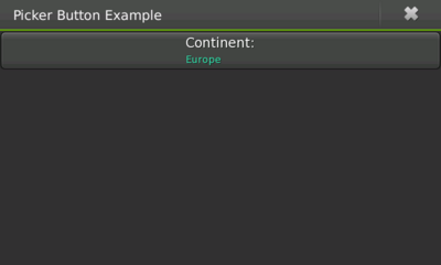
Picker buttons are the way to use a touch selector. When the user presses a picker button, the assigned touch selector is shown so the user can choose an option. The button will hold the text returned from the touch select print function as its value like shown in figure 12.
Figure 12: Picker button Image picker_button
Generally, any group of options from which a user must choose one should be presented using a picker button.
Date Selector
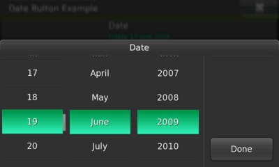
Date selectors are touch selectors that provide an easy way for the user to pick a date like shown in figure 13.
Figure 13: Date selector Image date_selector
Guidelines
- Assign the initial date of the date selector according the what's needed, that is, if the date is supposed to represent a future event then the initial date should be set to either the current day or the day after.
- On the other hand, if what's asked is a birthday then, the initial date should be set to January 1st of a previous year like 2000.
Date Button
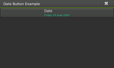
Date buttons work just like a picker button but use a date selector instead of a general touch selector.
Figure 14: Date button Image date_button
Time Selector
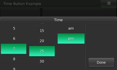
Just like date selectors, time selectors are touch selectors but target the selection of time like figure 15 shows (hour, minute, second and the AM/PM format depending on the 12/24 hour settings).
Figure 15: Time selector Image time_selector
Guidelines
- As mentioned for the date selector, the time selector's initial time should be set taking into account what's its purpose and context.
- For example, an application asks for a date and time of a future event, and the user was asked already for the date, in case he or she picks today's date, then the time selector's initial value should be set to later time than the current time.
Time Button
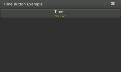
Time buttons launch a time selector when pressed and are the most common way of using a time selector.
Figure 16: Time button Image time_button
Toolbars
The use of regular toolbars in a Hildon application should be avoided. Fixed widgets like this waste too much precious space that could be used in a better way by the application.
Many times, toolbars hold controls that will perform the exactly same actions as for example a menu or a button. Hence, one way of removing a toolbar is to not consider the actions present on it that the user can already accomplish from another place. For example, text edition applications often use the buttons "New", "Open" and "Save" in their toolbars, when those actions are already present in a menu.
If there are actions designed for a toolbar that were not to be available from anywhere else in the application, then you should consider creating a new menu item that would show up a sub view with those actions.
On the other hand, there are actions in a toolbar that are constantly used - in an email application, the "New Message" is likely to be used all the time. Actions like this should be placed together with the application's main contents. So, the "New Message" button should be placed on top of the application's list of messages.
Exceptional Usage of Toolbars
Although toolbars should be avoided, there are special cases where they can come handy without compromising usability. For example, in an image edition application, if the application shows only the image, a toolbar could be used to provide quick access to edition tools.
Special Toolbars
Hildon provides special toolbars that target some specific need. Those toolbars are Find toolbar and Edit toolbar.
Find Toolbar
A find toolbar presents a familiar way for the user to enter content that should be searched. It provides a text entry with a dropdown list that will contain the search terms previously entered.
Applications should use this toolbar for search instead of having their own individual search interface.
Edit Toolbar
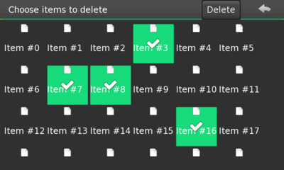
An edit toolbar allows the user to perform an action for a number of previously edited items. For example, an application that allows the user to delete a list of messages should have an edit toolbar that deletes the selected messages once the user clicks the toolbar's button.
Figure 17: Edit toolbar Image edit_toolbar
The toolbar's button should display a label describing what will be done. For the mentioned example, the button's label should be "Delete" (similar to what is shown in figure 17).
Buttons
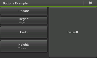
In Hildon you can use either a classical GTK+ button or a Hildon button. The latter has a title and value instead of just a label. The title appears in an upper area in the button with the value on the bottom part. For the GTK+ button case, you can create a normal GTK button but establishing a size that is optimized to be used by fingers - like the first and third buttons on the left side of figure 18.
Figure 18: Buttons Image buttons
Apart from the automatic height (button on the right in figure 18), a Hildon button is usually set to a "finger" or "thumb" heights like the buttons labeled "Update" and "Undo" on figure 18 respectively.
Guidelines
- Label all buttons with imperative verbs, using header capitalization. For example, Save, Sort or Update Now.
- After pressing a button, the user should expect to see the result of its action within one second. For example, closing the window or opening another.
- Make invalid buttons insensitive, rather than popping up an error message when the user clicks them.
Check Buttons
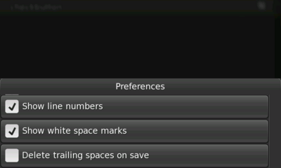
Check buttons are very close to the GTK+'s check boxes but in a form of a button (see figure 11.19) like the name suggests. They are used to represent two states of a given property. Below there are some guidelines taken and adapted from the GNOME HIG's Check Boxes Section as they apply to this widget.
Figure 19: Check buttons Image checkbuttons
Guidelines
- Do not initiate an action when the user presses a check button.
- Pressing a check button should not affect the values of any other controls. It may sensitize, insensitize, hide or show other controls, however.
- If toggling a check button affects the sensitivity of other controls, place the check box immediately above or to the left of the controls that it affects. This helps to indicate that the controls are dependent on the state of the check box.
- Use sentence capitalization for check box labels, for example Use custom font.
- Label check button to clearly indicate the effects of both their checked and unchecked states, for example, Show icons in menus. Where this proves difficult, consider using two radio buttons instead so both states can be given labels.
- Label a group of check button with a descriptive heading above or to the left of the group.
- Do not place more than about four check buttons if they are the height of a finger or three if they are the height of a thumb under the same group heading. If more check buttons are needed consider using a touch selector with multiple selection enabled.
Toggle Buttons
Toggle buttons look similar to regular button (see #Buttons), but are used to show or change a state rather than initiate an action. A toggle button's two states, set and unset, are shown by its appearing "pushed in" or "popped out" respectively.
Toggle buttons should be only used as filters in a View Menu (see figure 8), outside the menu, a picker button should be used instead because toggle buttons can create confusion since they look like regular buttons.
As for the filters in a View Menu, just like in other uses, it is recommended showing the buttons visually grouped. This makes it easier for the user to understand that each button represents an option among others when different options are displayed together.
Also note that the toggle buttons used are in fact GTK+ buttons and so, they will not support what a Hildon button supports like having a title and a value.
Guidelines
- Only use toggle buttons as filters in a menu. Use them in groups, so they are not mistaken for regular buttons. Make the group behave like either a group of check buttons or a group of GTK+ radio buttons, as required.
- Use the same text or graphical label for a toggle button whether it is set or unset.
Notebooks
The only case where a notebook should be used in Hildon is to be assigned to a wizard. The normal use of a tabbed notebook is not advised in Hildon, sub views should be used instead.
Progress Indicator
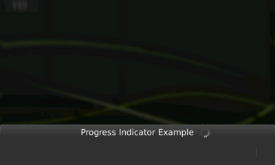
Sometimes, it is necessary to show the user that the application is performing some kind of task for which the user must wait. This is done by assigning a progress indicator to the dialog.
Figure 20: Progress indicator Image progress_indicator
A progress indicator is a non-intrusive spinning icon that is placed in a dialog's title area and give the immediate feeling that some operation is being processed (like shown in figure 20).
Guidelines
- Avoid the use of classical progress bars. Instead use the progress indicator.
- When the progress indicator is set on a dialog, then the dialog should not be showing any usable contents, that is, either showing insensitive contents or not showing any content at all.
- For operations that might take a while, consider also showing a banner once the long lasting operation starts. The banner should just remind the user that the task has started, for example, "Downloading messages". The banner should have a standard timeout, it shouldn't be always visible during the time the task is being performed.
- If you need to explain the user what the current step of the operation that a progress indicator is representing, then use a banner to accomplish that. Use simple and short descriptions for the steps, for example, "Authenticating", "Downloading", "Closing connection" instead of "Authenticating user in the server", "Downloading all messages from server" and "Shutting down the connection with the server".
- Even if some widgets present in the dialog are related to each step of a running operation, do not show them after the step, show all of them once the application is finished.
Sliders
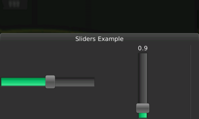
In Hildon, a GtkVScale or GtkHScale which will return a vertical or horizontal finger usable slider (like in figure 21), respectivaly. This widget should follow the same guidelines that are advised on GNOME HIG in the Sliders section.
Figure 21: Sliders figure Image sliders
User Input
There can be several ways to use a Hildon powered device. The user might be able to use the device in a specific orientation - landscape or portrait - using his or her fingers or a stylus.
These various types of input and usage will influence the way a user interacts with a graphical interface and hence, influence the way to develop that interface.
This chapter covers those different types of usage advising the interface designer or developer about what can result from choices about widgets placement and introduces concepts to avoid such problems.
Input Hardware
The input hardware is the hardware that a Hildon device provides the user so he or she can interact with it. Once the user interacts with a component of the input hardware, feedback should be provided by the device.
Hard Keys
The hard keys are the keys in the device that constitute hardware - the ones you can physically touch.
The set of hard keys available in a device surely varies according to the device and that difference must be taken into account when developing a Hildon application. Nonetheless, there are sets of keys that can be found in pretty much any device out there.
Common Hard Keys
- Power: This key is the most common given its basic but vital function.
- Lock/Unlock: This is also a common key that will set the device either sensitive or not to the touch. Note that although common there are devices who substitute is by soft keys.
- Increase/Decrease: Normally these keys are used to adjust the volume of the device sound or the zoom value in an application.
Optional Hard Keys
- Capture: Devices that feature such a key use it normally to active a camera and capture an image.
- Keyboard: Many devices feature a keyboard either always present or a slide-out one. Hildon supports two types of text input - the hardware keyboard and a touch screen text input method. The latter shouldn't be activated when the keyboard is available or slid out.
Finger Interaction
Devices using Hildon can be used with the fingers without the need of a stylus pointer. Also, those devices should be used in either a landscape or portrait orientation. Some devices might also be able to detect the orientation and adapt themselves to that mode.
Like described in the principles section, you must keep in mind that using the fingers to interact with the device will result in covering parts of the application. If the area that is being covered by the user's fingers/hand displays an important message, the user will not be able to see it. Hence, it is of extreme importance to choose a good placement of the widgets as well as to offer ways of letting the user to do it himself or herself.
Two Hand Usage
The two hand usage of a device happens when the user is holding the device with both hands and using the fingers to interact with it. In this case, the device will be in landscape mode.
If the user is using for example both thumbs to interact with the device, the area covered by them will be greater than if it was just one finger and hence, constitute a bigger challenge for the interface designer.
Two Hand Usage with Keyboard
Special attention is needed to the fact that some devices will also include an external keyboard that may slide-out from them.
In this case, the user keeps in the two hand mode but it might be difficult to reach for areas in the device screen as easily as if the keyboard wasn't out. So, take special attention to widgets that request interaction and placed on the top of the screen if the keyboard is out as they will require extra effort from the user.
One Hand Usage
When the user is using only one hand to hold and interact with the device, the device must be in portrait mode as it will not be easy to use in the landscape orientation.
The horizontal size of the screen will be less than the vertical size and the applications should adapt themselves to it. The usage of fixed sizes or static placements will difficult that adaption.
Soft Keys and Touch Types
The interaction in a Hildon device is made mainly by touching the screen so, there are different types of taps that are supported.
Single Tap
All interactive elements like controls, buttons, links, etc. can be activated by tapping and releasing on top of the element's control area.
The process of doing a single tap is divided in states. The following list describes those states for a better understanding of what a user can do with a single tap.
- Tap down: Once the user touches the screen, a visual effect might be produced in the element he or she is touching. For example, it highlights a button or makes the scroll indicator visible.
- Tap release: This state happens when the user lifts up his or her finger after a tap down. This will activate the element that was tapped such as a button or task launcher.
- Tap and cancel: If the user taps down on a fixed position element (such as button) and then moves his or her finger out of the element's area, it will not activate that element.
Long tap
Whenever a user taps and keeps the finger down for a longer time than what's usual, it will produce a long tap.
Long taps should be used only as a shortcut to a function that could be accessed in another way. Typically, a long tap will be used to bring out a context-sensitive menu in a list of items. For example, the user can long tap a contact in the contacts list to bring out a menu with options.
Stylus Interaction
Although Hildon widgets aim at being used by fingers, the stylus can obviously still be used when it is part of the hardware. However, its usage is only advisable for tasks that require a bigger precision such as browsing the web (most websites are designed to be used by a mouse), imaging applications like a drawing application and applications that need too many widgets to be shown at the same time (leaving no space for fingers).
Dimensions
A button that is meant to be clicked by a mouse or a stylus is not usually easily pressed with a finger because of the small size. Apart from the size, the placement of a widget right next to another will require more precision and hence make them difficult to be pressed by fingers.
The horizontal size of the screen will be less than the vertical size and the applications should adapt themselves to it. The usage of fixed sizes or static placements will difficult that adaption.
The Hildon API provides defined values to make it easy to set the size of controls in a relative way
Hildon control size types are:
HILDON_SIZE_AUTO_WIDTH /*Automatic width*/
HILDON_SIZE_HALFSCREEN_WIDTH /*Half of the screen width*/
HILDON_SIZE_FINGER_HEIGHT /*A finger height*/
HILDON_SIZE_THUMB_HEIGHT /*A thumb height*/
HILDON_SIZE_AUTO /*Automatic height and width*/
You should use the size variables above when you need to choose a size for a widget that will require the user's control according to the way you want the user to use it. For example, if you place a button on a bottom corner of the screen, it is likely that that the user will use his thumbs to press the button, hence you should choose the HILDON_SIZE_THUMB_HEIGHT for it.
Interaction Actions
A Hildon powered device provides different types of actions that can be done. Some of those actions are equal to what would be done in a computer while others are rather different or innovative.
The following sections describe these actions or interactions.
Copy, paste, cut
The text input fields support the common actions of copying, pasting or cutting. For that, the user can use the hardware keyboard (if available) shortcuts Ctrl+c, Ctrl+v, Ctrl+x, respectively.
Panning
Hildon discourages the use of scrollbars on interfaces intended to be used with fingers. The concept of panning refers to navigate through content on screen by dragging on top of the contents. When the user enters elements that hold content that cannot be fully viewed within the screen area, a scroll indicator should appear on the right and bottom sides of the screen and the user can drag on top of that area to navigate through the contents.
Icons
Many applications share similar tasks that can can be represented by a generally known icon. For example, several applications have "Previous", "Next" or "Back", "Forward" actions that can represented by arrow icons. For these kind of actions applications should not ship their own icons, they should use the system icons instead (known as stock icons). An alternative is to ship any desired icons but using the common task ones only when there is no equivalence in the system.
In a device with a touch screen, since there is no mouse, there will be no tooltips, hence choosing an icon when there is no text label in the widget involves an even more important decision than in a desktop computer. If the user doesn't readily understand what's the action assigned to a button with only an icon, he or she will need to read any help document about the application but is likely to press that button in order to check what's its function (which might not result in what the user wants). If an icon doesn't seem clear enough for the task it represents, then don't use it, use a text label instead. Text labels generally give a better explanation to a user. Apart from the mentioned common tasks, the only way where an icon might be preferable to a text label is when there's no space for the text.
For general guidelines on the design of good icons, please read the GNOME HIG Icons section.
Reality Checks
The sections in this chapeter give advices on how to make your application even more usable when it can already be tested. Other very useful checks can be found in the GNOME HIG Checklists Section.
Harware Keys
Check the keys of the mobile device you're testing your application with to see they could be assigned any functions already existing or new functions. This way you might find out that some actions by not need an actual control on screen as they could be assigned to a commonly used hardware key.
Different Devices
Given the plurality of mobile devices out there and their differences, you'll maybe find out that some features of your application do not behave as desired in one device or another. Therefore, it extremely important to be able to either test it in those devices or let those devices users give you feedback about it

