Legacy Maemo 5 Documentation/Human Interface Guidelines/Dialogs
(New page: =Dialogs= Although derived from GtkDialog, Hildon dialogs behave differently than in a traditional desktop environment. To make them more usable, dialogs are placed at the bottom of the sc...) |
(add link) |
||
| (6 intermediate revisions not shown) | |||
| Line 1: | Line 1: | ||
| - | + | {{Legacy documentation}} | |
| - | + | ||
| - | + | {{main|Legacy Maemo 5 Documentation/Graphical UI Tutorial/Windows and dialogs#Dialogs}} | |
| - | + | Although still created with a <code>GtkDialog</code>, Hildon dialogs are really different from the ones in a desktop environment. For a better usage, they are placed in the bottom of the screen and their buttons are placed on the right side. Dialogs can be closed by pressing the dimmed area that remains as the desktop background. | |
| - | + | Keep the number of dialog buttons low. Dialogs should not have a cancel button, that task is accomplished by pressing the dimmed area. | |
| - | + | Dialogs should be used for small tasks, for example, asking for a category name when creating a new category in an email client application. In this example, there should be an entry for the user to enter the category name and a button "Create". | |
| + | [[Image:dialog.png|frame|center|alt=Screenshot of a dialog|Figure 6: A dialog]] | ||
| - | For | + | For bigger tasks like managing an email account folder like "Inbox" (browsing through the messages, deleting, editing them, and so on), use a view, not a simple dialog. |
| - | + | ||
==Wizard Dialogs== | ==Wizard Dialogs== | ||
| - | |||
| - | + | A wizard is a dialog that divides a certain task in sequential steps. With this special dialog, you can present a complex operation to the user in an easier and simpler way. | |
| - | + | The first page of the wizard is a welcome page and its title is the wizard's name followed by "Welcome". Similarly, the title of the wizard's last page is the wizard's name combined with "Finished". The in-between pages' titles are a result of the combination of the wizard's name and that page's title in wizard's assigned notebook. | |
| - | + | [[Image:Example wizard dialog.png|frame|center|alt=Screenshot of a wizard dialog|Figure 7: A wizard dialog]] | |
| + | Wizards contain three buttons - Finish, Previous and Next - which are dimmed or undimmed automatically according to the current page of the wizard. | ||
| - | + | Because the first page is the welcome page, it should not have widgets that require user input (apart from the buttons) but instead tell the user what the wizard is there for. That information must suggest what to expect from the wizard's steps as well as what will happen when the wizard finishes. The last page must resume important choices made by the users along the pages and recall what will happen when they press the "Finish" button. Widgets that express important choices must not be added to the last page although simple choices, like showing a README file, can be added. The in-between pages are the ones where users should be asked to enter information or choose important/main choices. For these pages, explain by providing labels and captions what each requested information or choice is about. | |
| - | + | Remember, a wizard is supposed to make a task simpler, not the opposite. Hence, you should not use it unless you are sure you will simplify things for the user. For example, if the task is just to present some information and a couple of checkboxes for the user to set some preferences, use a normal dialog, not a wizard. On the other hand, if the user is requested to set a number of settings dependent on each other in a sequential way, use a wizard. | |
Latest revision as of 14:19, 31 January 2011
| This article is legacy documentation, and is superseded by Forum Nokia documentation. The Forum Nokia documentation is available as the Hildon 2.2 UI style guide, Fremantle master layout guide and the Hildon 2.2 widget UI specification |
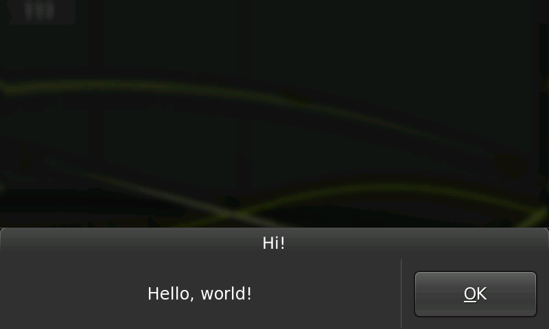
Although still created with a GtkDialog, Hildon dialogs are really different from the ones in a desktop environment. For a better usage, they are placed in the bottom of the screen and their buttons are placed on the right side. Dialogs can be closed by pressing the dimmed area that remains as the desktop background.
Keep the number of dialog buttons low. Dialogs should not have a cancel button, that task is accomplished by pressing the dimmed area.
Dialogs should be used for small tasks, for example, asking for a category name when creating a new category in an email client application. In this example, there should be an entry for the user to enter the category name and a button "Create".
For bigger tasks like managing an email account folder like "Inbox" (browsing through the messages, deleting, editing them, and so on), use a view, not a simple dialog.
[edit] Wizard Dialogs
A wizard is a dialog that divides a certain task in sequential steps. With this special dialog, you can present a complex operation to the user in an easier and simpler way.
The first page of the wizard is a welcome page and its title is the wizard's name followed by "Welcome". Similarly, the title of the wizard's last page is the wizard's name combined with "Finished". The in-between pages' titles are a result of the combination of the wizard's name and that page's title in wizard's assigned notebook.
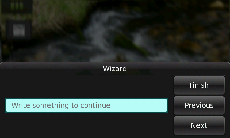
Wizards contain three buttons - Finish, Previous and Next - which are dimmed or undimmed automatically according to the current page of the wizard.
Because the first page is the welcome page, it should not have widgets that require user input (apart from the buttons) but instead tell the user what the wizard is there for. That information must suggest what to expect from the wizard's steps as well as what will happen when the wizard finishes. The last page must resume important choices made by the users along the pages and recall what will happen when they press the "Finish" button. Widgets that express important choices must not be added to the last page although simple choices, like showing a README file, can be added. The in-between pages are the ones where users should be asked to enter information or choose important/main choices. For these pages, explain by providing labels and captions what each requested information or choice is about.
Remember, a wizard is supposed to make a task simpler, not the opposite. Hence, you should not use it unless you are sure you will simplify things for the user. For example, if the task is just to present some information and a couple of checkboxes for the user to set some preferences, use a normal dialog, not a wizard. On the other hand, if the user is requested to set a number of settings dependent on each other in a sequential way, use a wizard.
- This page was last modified on 31 January 2011, at 14:19.
- This page has been accessed 15,049 times.


