Task:Improving the Application manager
(→Category view) |
|||
| Line 12: | Line 12: | ||
== Category view == | == Category view == | ||
I was having a discussion with X-Fade today on the repository category mess, and the possibility of having usable categories besides "All" (sadly, I haven't even looked at anything but "All" since at least OS2005 :\) made me consider some of the issues with the current category setup in Application manager. | I was having a discussion with X-Fade today on the repository category mess, and the possibility of having usable categories besides "All" (sadly, I haven't even looked at anything but "All" since at least OS2005 :\) made me consider some of the issues with the current category setup in Application manager. | ||
| + | |||
| + | [[Image:Application manager grid-view mockup.jpg|center|Mock-up of the grid-view]] | ||
=== Grid view === | === Grid view === | ||
| - | |||
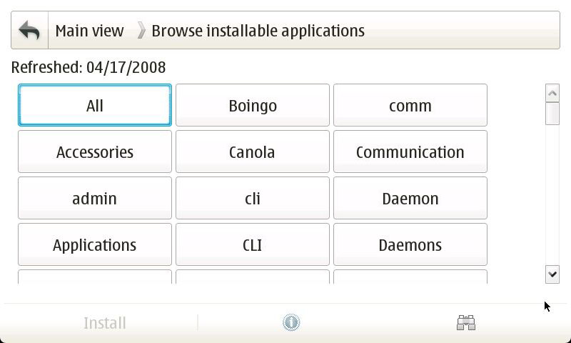
The current category view has an awful lot of wasted whitespace. My initial reaction here was that a grid view in place of a the current list-view would make better use of space and improve the thumb-ability (ordering is badly messed-up in my mock-up—it should be left-to-right rather than top-to-bottom). The number of packages in each category should be noted parenthetically next to the category name (shown in the tree-view mock-up). | The current category view has an awful lot of wasted whitespace. My initial reaction here was that a grid view in place of a the current list-view would make better use of space and improve the thumb-ability (ordering is badly messed-up in my mock-up—it should be left-to-right rather than top-to-bottom). The number of packages in each category should be noted parenthetically next to the category name (shown in the tree-view mock-up). | ||
This view does have a few downfalls, though. It doesn't make it easy to see what's in any particular category, so if you're searching for something or just browsing around, you will be jumping between the category view and application list view quite a bit. Which is expensive in taps and rendering. Also, longer category names may cause rendering issues ('''Communications''' becoming '''Communicat...''' is just plain bad). | This view does have a few downfalls, though. It doesn't make it easy to see what's in any particular category, so if you're searching for something or just browsing around, you will be jumping between the category view and application list view quite a bit. Which is expensive in taps and rendering. Also, longer category names may cause rendering issues ('''Communications''' becoming '''Communicat...''' is just plain bad). | ||
| - | [[Image:Application manager tree-view mockup.jpg| | + | [[Image:Application manager tree-view mockup.jpg|center|Mock-up of the tree-view]] |
| + | |||
=== Tree view === | === Tree view === | ||
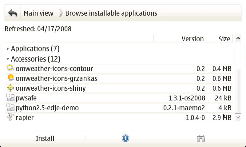
The grid-view is probably the most straightforward and immediate solution, but some extra options wouldn't hurt. Some sort of tree view (while mildly ungainly with such limited screen real estate) could give a nice overview alternative to "All" while reducing the number of screens the user needs to scroll through. Show all the categories as collapsible branches, and indicate the number of packages in each category parenthetically next to the category name. The user can collapse or expand a branch by tapping on the category name, or using the dpad up/down to scroll to the desired category and the left/right to collapse or expand it. | The grid-view is probably the most straightforward and immediate solution, but some extra options wouldn't hurt. Some sort of tree view (while mildly ungainly with such limited screen real estate) could give a nice overview alternative to "All" while reducing the number of screens the user needs to scroll through. Show all the categories as collapsible branches, and indicate the number of packages in each category parenthetically next to the category name. The user can collapse or expand a branch by tapping on the category name, or using the dpad up/down to scroll to the desired category and the left/right to collapse or expand it. | ||
| + | |||
| + | [[Image:Application manager column-view mockup.jpg|center|Mock-up of the column-view]] | ||
=== Column view === | === Column view === | ||
| - | |||
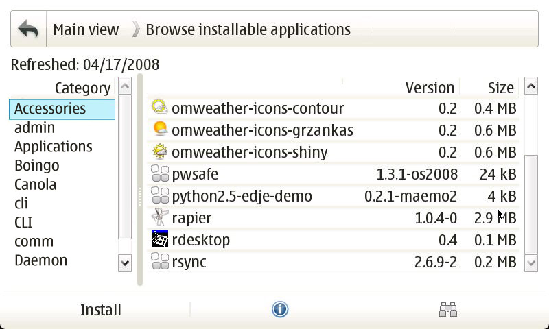
Finally a column view could be another useful alternative for reducing the number of screens to tap through and provide a better overview. Put a column of categories on the left (again, with the number of packages in each category indicated parenthetically) and display the packages in that category in the right column. Basically, the same behavior as the File manager. | Finally a column view could be another useful alternative for reducing the number of screens to tap through and provide a better overview. Put a column of categories on the left (again, with the number of packages in each category indicated parenthetically) and display the packages in that category in the right column. Basically, the same behavior as the File manager. | ||
Revision as of 17:50, 19 June 2008
As one of the foremost application's in a new user's experience of Maemo, Application manager needs to be one of the platform's best (perhaps only superceded by the browser and email client). As it stands, though, it is still in need of improvement in a lot of areas. Some of these improvements are small changes (like allowing the repository list to be refreshed from the main view), and some of them are quite large (like the category view overhaul), but the end result should be a much better and more usable Application manager.
Contents |
Main view
The main view is a user's portal to Maemo software, it's largely fine right now, but not very interesting. It needs a way to draw in new users and get them interested in the software available to them.
New buttons
One way to do this is add a few buttons over on the right hand side (where the big Application manager icon is right now). Something like, Featured applications (taken from Downloads), Popular applications (also from Downloads), and New applications (since last repository refresh, or maybe new in the last week—the specifics of this one will need consideration). As most of the Featured and Popular applications will reside in Extras (and Extras ships disabled), this would serve as a nice way to introduce new users to Extras by offering to enable it for them when they go to install an application from these lists.
Button bar
The button bar is another small problem with the main view. Right now, all the icons are grayed out and useless. At the very least, the repository refresh button should be enabled here. The search button could be enabled to perform a global search (with filters for available/installed applications), the install button could be replaced with the repository list, and the info button could show the logs.
Category view
I was having a discussion with X-Fade today on the repository category mess, and the possibility of having usable categories besides "All" (sadly, I haven't even looked at anything but "All" since at least OS2005 :\) made me consider some of the issues with the current category setup in Application manager.
Grid view
The current category view has an awful lot of wasted whitespace. My initial reaction here was that a grid view in place of a the current list-view would make better use of space and improve the thumb-ability (ordering is badly messed-up in my mock-up—it should be left-to-right rather than top-to-bottom). The number of packages in each category should be noted parenthetically next to the category name (shown in the tree-view mock-up).
This view does have a few downfalls, though. It doesn't make it easy to see what's in any particular category, so if you're searching for something or just browsing around, you will be jumping between the category view and application list view quite a bit. Which is expensive in taps and rendering. Also, longer category names may cause rendering issues (Communications becoming Communicat... is just plain bad).
Tree view
The grid-view is probably the most straightforward and immediate solution, but some extra options wouldn't hurt. Some sort of tree view (while mildly ungainly with such limited screen real estate) could give a nice overview alternative to "All" while reducing the number of screens the user needs to scroll through. Show all the categories as collapsible branches, and indicate the number of packages in each category parenthetically next to the category name. The user can collapse or expand a branch by tapping on the category name, or using the dpad up/down to scroll to the desired category and the left/right to collapse or expand it.
Column view
Finally a column view could be another useful alternative for reducing the number of screens to tap through and provide a better overview. Put a column of categories on the left (again, with the number of packages in each category indicated parenthetically) and display the packages in that category in the right column. Basically, the same behavior as the File manager.
Each of these views has their own advantages and disadvantages, as such, a single view shouldn't be picked at the exclusion of all others, rather, all views could be implemented and a switch (either in the menu, or on the button bar, and perhaps as shortcuts for N810 users) added to toggle between them depending on user-preference on use-case.
Application list
The application list is where most of the user's time will be spent—browsing and installing/removing/updating applications and packages—and is arguably the most important area of the Application manager. As it stands, most of what's wrong with the application list is either technical (e.g., the irritating list refresh) or related to the various dialogs related to the list (e.g., the info dialog), and the basic UI of the application list is really quite fine.
- Columns should be sortable by tapping their names, as well as from the menu.
- List refresh needs to be somehow sped up on completely eliminated. This is much better in Diablo, as it doesn't refresh whenever you look at it funny, but still a problem.
Info dialog
What the information dialog suffers from is a bad case of the scrollies. Practically every tab for almost every package presents the user with a horizontal scroll bar. This should really never happen for a native widget.
Or of both of these things will reduce the occurrence of the horizontal scroll bar:
- The horizontal width of the info dialog should be expanded slightly to contain more information (there is a lot of additional room available in fullscreen).
- The information being displayed should be intelligently soft-wrapped and/or slightly reformatted to fit into the dialog.
Summary
The summary tab is mostly OK. Adding a "Repository" item to indicate which repository a package is in would be useful (especially for identifying Extras and Extras-devel packages). The largest problem is the short description that doesn't get soft-wrapped. Soft-wrapping this description would eliminate the horizontal scrolling in most cases for the summary tab.
Description
The description field also needs soft-wrapping to make some descriptions fit. The problem here is that many descriptions are already hard-wrapped, which might result in ugly half-soft/half-hard–wrapped text. This may need to be addressed packaging-side.
Installing/Uninstalling/Upgrading/Problems
This tab is a particularly bad offender, as the content is a known value—we know the type of information that appears here and we can predict how it will be formatted. The first and simplest solution is to take all of the packages under each heading and aligned them with the left side of the dialog. Most of the problems crop up from having such a huge amount of whitespace to the left of the package lists, so bringing these lists down a line and over to the left would eliminate a lot of horizontal scrolling. The headings (e.g., "Application packages missing:") will need to be offset from the text somehow, too.


