Maemo.org logo contest submissions
(→Entries for maemo.org logo contest) |
(→Munk) |
||
| Line 644: | Line 644: | ||
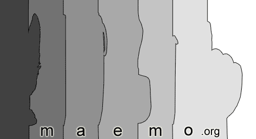
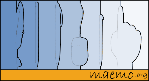
Image:Maemo.org_logo_contest_Munk_073.png|Evolution! This is to symbolize evolution from feather and ink interface to pencil to pen to mouse to stylus to arrive at touch. The lines that make up them symbolize time lines in history. | Image:Maemo.org_logo_contest_Munk_073.png|Evolution! This is to symbolize evolution from feather and ink interface to pencil to pen to mouse to stylus to arrive at touch. The lines that make up them symbolize time lines in history. | ||
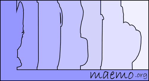
Image:Maemo.org_logo_contest_Munk_074.png|Evolution! Blue. (Keeping the color palette simple for elegance and I also can't make up my mind) | Image:Maemo.org_logo_contest_Munk_074.png|Evolution! Blue. (Keeping the color palette simple for elegance and I also can't make up my mind) | ||
| + | Image:Maemo.org_logo_contest_Munk_075.png|Evolution! Colored and spelled out. | ||
</gallery> | </gallery> | ||
Revision as of 05:33, 27 July 2008
This page contains submissions for the maemo.org logo contest. The contest is now open! The closing date for entries is the 27th of July, 2008. For rules and submission guidelines, please see the contest page.
Entries for maemo.org logo contest
attila
deadknight88
crawfordm
thiercito
Less is More concept of the maemo.org logo. By adapting the letter "a" into the "e" we are suggesting the versatility and adaptiveness of the maemo platform
jobelium
I did that with free font and a lot of fun ! :p
NB: Most of then can be colored differently.
J'ai fait cela avec des fonts gratuits et beaucoup de plaisir ! ;)
NB:la couleur de la majorité de mes logos peut être modifié.
PS: im a frenchspeaker, sory for the inconveniant!
rsperberg
Some thoughts behind the design posted at Internet Tablet Talk. The "M" in the first logo, the "g" in the latter can be tweaked to satisfy everyone. Enjoy! Roger
GarethLWalt
Alternative to a previously removed image (due to a resemblance to another company's logo. More info in the Discussion.) |
|
baksiidaa
joeaguy
Narbat
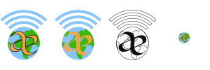
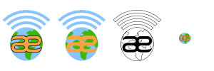
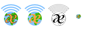
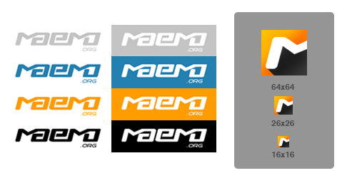
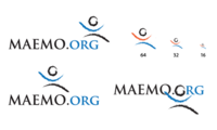
Variations on a theme, using different fonts. The "ae" in "maemo" seems to stand out, so I wanted to incorporate that into the design. I also wanted to incorporate something about what the platform is, hence the globe and wifi signal bars. These logos can be used with the full "maemo.org" spelled out, or just the globe and "ae" portion for when something narrower is needed. In the variations you can see what the logo looks like in monochrome, and how it looks as a 16x16 favicon. This logo uses only four colors (blue, green, orange, and black) with no gradients or dithering, which makes it easy to silk-screen onto a t-shirt.
jussi
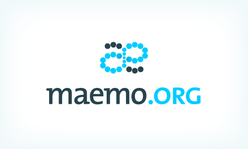
The basic idea: The dots represent the many parts which make up the community, and together they form the ae-ligature and a moebius strip, to signify the infinite possibilities of collaboration.
I started over a little. After coming back a while later and looking at my submissions, this is what I thought.
- After looking at it again; I felt like the ae-ligature didn't really work as it was. It is not 100% clear, and it doesn't work nicely with the typography; and I don't think it will in the current dot format.
- I still liked the moebius strip formed of dots, though, which I think is a strong idea which works really well in this context, so I decided to keep it.
- I wanted the logo to be "nicer", friendlier, more organic. That is more what a community is like, not something digital, gridded and rough.
- This also applied to the colours. A cooler, smoother colour would be better than an agressive orange.
- The typography was changed to one that has a little more character.
Updated as of july 26.
(the old ones are on the talk page)
calderov
chrismtn
convulted
rsuplido
Helvetica is used on all logos, my favorite font. All logos use orange-red as the background but can be anything. I hope you enjoy them. --Reggie 13:45, 21 June 2008 (UTC)
Morse Code: Simple and sharp. I added the morse code version of 'maemo' at the bottom to signify a classic sense of 'communication.' Click image for a sharper version of the logo. |
Zen: maemo is syllabicated and placed inside a Zen Enso symbol. Parts of 'maemo' and '.org' touch the circle. Circle is intentionally broken since "imperfection is an essential and inherent aspect of existence." Click image for a sharper version of the logo. |
Syntax 1: maemo.org is represented in a Syntax diagram. It somehow shows that maemo can be open source via the '.org' or can be bypassed, maybe to signify commercial apps. Click image for a sharper version of the logo. |
Syntax 2: maemo.org is represented in a Syntax diagram. A playful version to represent an infinite loop -- a never-ending maemo community discussion. Click image for a sharper version of the logo. |
Cas
furrball
michael
femorandeira
angun33
wazd
Hello. I had some troubles with "Maemo.org" name so I used "Maemo-org" instead. Sorry for that.
Logo symbolizes I think all of the community aspects. A not childish but not too old (as our community is) human (as a main part of the community) spread his hands to all the people (we are welcome to everyone) and same time he breaks the borders and reaches the outer perspectives (same thing that we do in our open source world without any limitations) By the way "open source" is nicely integrated here too. His head shines bright with ideas in all ways like the sun. And if you'll place two logos near, people will look like they shaking hands. Logo can be anycoloured, but I prefer blue cause it's very calm for website design :) Whew, I'm done :)
rrainist
timsamoff
Note: I've honed my submissions down to my favorite ideas. For the rest, please view the Discussion page. --timsamoff 14:38, 26 June 2008 (UTC)
- Really appreciated. Pruning is a well known method to get better flowers and fruits.--qgil 15:41, 26 June 2008 (UTC)
polyxena
blaxnux
mrunx
Variations on a Maemo "good vibes" theme...
- Typography used: "Domestic Manners", a Public Domain/GPL font by Dustismo
firebird8
aakash121
shivankan
sohle
underscore
Two versions of each image were submitted in case there was an issue using the Nokia stylus in the logo. I substituted a generic stylus into the second image. Hopefully this wont cause any complications. :) *I have the images available without gradients as well, if that becomes an issue.
- The ideas is cool and personaly I like the little man drawing. However, an issue to consider here is that Maemo-the-software is moving towards thumb/finger use as default, being a stylus a secondary case. In my opinion this concept wouldn't survive the next Maemo releases...--qgil 06:45, 27 June 2008 (UTC)
![]() This is a possible favicon for entries 3, 4, 5, and 6.
This is a possible favicon for entries 3, 4, 5, and 6.
eemaju
The purpose was to emphasize strong and happy colors and humane factors. Bright color was selected to gain more visibility, and orange contains legacy from maemo perspective. Fingerprint is driven by the presence of touch, as well as the font face which looks like that it is hand drawn. Tried to remove everything that can be considered "technical".
lav4you
Maemo.org This name and logo is created keeping in the mind that now maemo can handles more and more complex apllication and processes, e of maemo articulates that complexity of it and the integrity among the community and developer with fresh illusive look. I hope you will like it.
Here joint m indicates the integrity between man (Developer Community & users), maemo and mobile.
Below design reflect the horizon at which Maemo stands. Its simplicity and usability is indicated in the form of illusive teddy bear look, M with the butterfly effect indicates the open source community philosophy. Its rareness is indicated by illusive panda effect,integrity and sharing between community members is indicated through joint OO effect and popularity of Maemo is reflected in these catchy icon.
In these design the butterfly effect reflects the open source community philosophy. Different colors in butterfly wings or M articulates the wide application of Maemo software, its mobility aspects and different culture of developers and users.
pixel6784
gavren
affonso
This logo focus on transmitting two of the key concepts of maemo.org: team work and freedom. To illustrate these ideas the typography was drawn with characters that varies on rotation and size but at the same time supersedes it other and sharing the same place. --Abraão Affonso @ OpenBossa Design Team (http://www.openbossa.org)
This logo aims to highlight though simple forms the most important characteristics of Maemo.org like the sense of community and spirit of innovation. It also transmits the feeling of continuity, one of the keys to open source success, by using a custom font that mimics the word "maemo" as it would like if written with a single stroke. --Abraão Affonso @ OpenBossa Design Team (http://www.openbossa.org)
glaoliver
Simplicity and connectivity were the main concepts used to design this logo. Though its elegant forms and precise use of color represents some of the basic valors of maemo.org: like creativity. stability and cleverness, something that can be trust. --Glaubert Oliveira @ OpenBossa Design Team (http://www.openbossa.org)
The idea behind this logo is about continuity and improvement of a process, it reflects how maemo.org acts as a bridge uniting people who share the same objectives and goals. --Glaubert Oliveira @ OpenBossa Design Team (http://www.openbossa.org)
This logo is based on the relationship, evolution and continuous effort of the maemo community to attain better solutions and products in less time. It also transmits trough it typography and discreet use of color the idea of technology, movement and boldness. --Glaubert Oliveira @ OpenBossa Design Team (http://www.openbossa.org)
peres
This logo focus on the technological and sharing aspects of maemo.org, It represents the bound and the energy that constantly flows from the point where the platform meets the community. --Miguel Peres @ OpenBossa Design Team (http://www.openbossa.org)
This logo emphasizes some of the principals aspects and objectives of the maemo community like sharing/reuse, technology and improvement. It transmits a solid aspect and at the same time illustrates something flexible with parts that can be easily rearranged. Its unique and simple typography aims to look clear in different sizes and resolutions and has also a hidden catch to make "maemo.org" easy to remember, representing some of the fun and joy of being part of this community. --Miguel Peres @ OpenBossa Design Team (http://www.openbossa.org)
nazo
This logo is simple and clean. It's easy and economic for producing promotional gifts and brochures as it contains two colours.
setan_666
jrouyer
karnhack
wavek9
amirullah
Maemo.org logo contest amirullah- 001-.png
flexybility, applicable (eq.: like 'E' to 'M') |
Maemo.org logo contest amirullah- 002-.png
across the world |
Maemo.org logo contest amirullah- 003-.png
menembus batas (speed, accuracy, break the target) |
brnk
The ae feature symbolizes the interaction of people within the community. The hand has many meanings in this context, the most important being that Maemo is used in hand-held devices, the 'hand-work' of the community and the outreach to future contributors (its a high-five, isn't it... or some sort of greating). |
|
unique311
srosa
samlowry
shockgen
cjb
This peculiar design may not seem creative, but hope to add some meaning to maemo. The m2o icon is a isolation of three letters in maemo “mmo” (the number 2 representing two m’s) which stands for maemo | mobile | open source. I know this is debatable and probably will not be used. But hope to spark interest of what maemo is. |
samantha
vdepizzol
Munk
rambutan
amir
Maemo.org logo contest amir 1.png
red arrow at 'M', likely accuracy |
Maemo.org logo contest amir 2.png
red arrow at smooth 'M', likely accuracy |
Maemo.org logo contest amir 3.png
the sign, simplicity but validity -- applicable in many background colours. |
mexicopepito
ubikdosmil
jensen
Bundyo
All designs are vector and available as Inkscape SVG format.
|
navneet
jrocha
The way each of the "ae" curves fit into each other sugests interaction, contact and communication at a high-speed which, from simple shapes form the letters "ae". This is what happens in an FOSS comunity, everybody syncs and interacts with each other to come up with great tools. Also it suggests the hability for Maemo to allow one to do all this from any place. |
amir
Maemo.org logo contest amir- 2-.PNG
smooth red arrow 'at M' up right to target |
|


