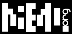
Maemo.org logo contest submissions
(→baksiidaa) |
(Added Narbat's logos) |
||
| Line 109: | Line 109: | ||
Image:Maemo.org_logo_contest_joeaguy_2.png|Bitmap with negative space, narrow. Minimalist pixel theater. | Image:Maemo.org_logo_contest_joeaguy_2.png|Bitmap with negative space, narrow. Minimalist pixel theater. | ||
Image:Maemo.org_logo_contest_joeaguy_3.png|Bitmap with negative space, narrow and inverse. Now is the time on Sprockets when we dance. | Image:Maemo.org_logo_contest_joeaguy_3.png|Bitmap with negative space, narrow and inverse. Now is the time on Sprockets when we dance. | ||
| + | </gallery> | ||
| + | |||
| + | === Narbat === | ||
| + | |||
| + | Variations on a theme. Same idea, using a stylized "ae" combination with a background of the globe, with wifi connection lines above. First is the full logo, then an abbreviated version for when the whole word isn't needed. Finally, each variation has a black-and-white variation. | ||
| + | <gallery widths="378px" perrow="2"> | ||
| + | Image:Maemo_org_logo_contest_narbat_1.png|Font A | ||
| + | Image:Maemo_org_logo_contest_narbat_2.png|Font B | ||
| + | Image:Maemo_org_logo_contest_narbat_3.png|Font C | ||
| + | Image:Maemo_org_logo_contest_narbat_4.png|Font D | ||
| + | Image:Maemo_org_logo_contest_narbat_5.png|Font E | ||
| + | </gallery> | ||
| + | <gallery widths="300px" heights="300px"> | ||
| + | Image:Maemo_org_logo_contest_narbat_6.png|Size Comparisons. The 16x16 favicon doesn't have the wifi lines. The flat globe is used in all the above logos; a more spherical shading is also available (but is probably too busy for small areas). With the flat shading the logo only requires four colors: blue, green, orange, and black. Perfect for silk-screening onto a t-shirt! | ||
</gallery> | </gallery> | ||
Revision as of 03:39, 20 June 2008
This page contains submissions for the maemo.org logo contest. The contest is now open! The closing date for entries is the 27th of July, 2008. For rules and submission guidelines, please see the contest page.
Contents |
Entries for maemo.org logo contest
attila
deadknight88
dzahariev
crawfordm
fredyrivera
jobelium
Maemo.org logo contest jobelium 6.png
|
||
Maemo.org logo contest jobelium 7.png
|
||
Maemo.org logo contest jobelium 10.png
|
Maemo.org logo contest jobelium 11.png
|
Maemo.org logo contest jobelium 12.png
|
Maemo.org logo contest jobelium 14.png
|
Maemo.org logo contest jobelium 15.png
|
|
Maemo.org logo contest jobelium 16.png
|
Maemo.org logo contest jobelium 17.png
|
Maemo.org logo contest jobelium 18.png
|
Maemo.org logo contest jobelium 19.png
|
Maemo.org logo contest jobelium 21.png
|
asgari
rsperberg
GarethLWalt
baksiidaa
joeaguy
Narbat
Variations on a theme. Same idea, using a stylized "ae" combination with a background of the globe, with wifi connection lines above. First is the full logo, then an abbreviated version for when the whole word isn't needed. Finally, each variation has a black-and-white variation.
Maemo org logo contest narbat 1.png
Font A |
Maemo org logo contest narbat 2.png
Font B |
Maemo org logo contest narbat 3.png
Font C |
Maemo org logo contest narbat 4.png
Font D |
Maemo org logo contest narbat 5.png
Font E |
Maemo org logo contest narbat 6.png
Size Comparisons. The 16x16 favicon doesn't have the wifi lines. The flat globe is used in all the above logos; a more spherical shading is also available (but is probably too busy for small areas). With the flat shading the logo only requires four colors: blue, green, orange, and black. Perfect for silk-screening onto a t-shirt! |


