Hildon-Extras
(→=Qt integration) |
|||
| Line 7: | Line 7: | ||
Hildon-Extras is very close to being released. The components are considered quite stable, but some small polishing is needed until release. | Hildon-Extras is very close to being released. The components are considered quite stable, but some small polishing is needed until release. | ||
| - | ===Qt integration== | + | ===Qt integration=== |
There is a class called QtHeWrapper in Hildon-Extras that is provided to developers of [[Qt]]-based apps. It is a [http://en.wikipedia.org/wiki/Wrapper_library wrapper] that provides interoperability between Hildon-Extras and [[Qt]] code. It allows developers to call Hildon-Extras easily from [[Qt]]-based software. | There is a class called QtHeWrapper in Hildon-Extras that is provided to developers of [[Qt]]-based apps. It is a [http://en.wikipedia.org/wiki/Wrapper_library wrapper] that provides interoperability between Hildon-Extras and [[Qt]] code. It allows developers to call Hildon-Extras easily from [[Qt]]-based software. | ||
Revision as of 17:40, 19 July 2010
Hildon-Extras is a set of community-contributed widgets (that's GTK+ widgets, not Desktop widgets) and dialogs that can be used by application developers to provide a usable, well-balanced interface. Some of these widgets provide functionality that the "stock" Hildon widgets don't provide, and some dialogs are touch-friendly versions of existing dialogs in GTK+ and/or Hildon.
Contents |
Current status
Hildon-Extras is very close to being released. The components are considered quite stable, but some small polishing is needed until release.
Qt integration
There is a class called QtHeWrapper in Hildon-Extras that is provided to developers of Qt-based apps. It is a wrapper that provides interoperability between Hildon-Extras and Qt code. It allows developers to call Hildon-Extras easily from Qt-based software.
The QtHeWrapper currenty supports all the dialogs in Hildon-Extras. It allows for easily displaying any of the dialogs.
List of applications using Hildon-Extras
- Conboy (HeCheckButton, HeFullscreenButton, HeAboutDialog)
- MaePad (HeAboutDialog, HeFullscreenButton, HeSimpleColorDialog)
- MRAWViewer (HeFullscreenManager at the moment, planning to add HeAboutDialog for the next release)
- Mapper (HeAboutDialog)
- Custom Operator Name Widget (HeColorDialog)
- gPodder (HeAboutDialog)
- Panucci (HeAboutDialog)
- Queen BeeCon Widget (HeFont*, He*Color*)
- Sticky Notes (HeSimpleColorDialog and HeAboutDialog since version 0.2)
- (add yours here)
Widget Gallery
HeAboutDialog
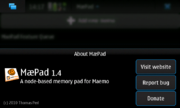
The HeAboutDialog is a replacement for GtkAboutDialog and provides a finger-friendly, good-looking about dialog with optional buttons for:
- Project website
- Bug tracker ("Enter new bug")
- Donations page
There is a wrapper that can be used by Qt-based applications for this dialog in QtHeWrapper.
If you are writing a Python application, you might be interested in the Python port of HeAboutDialog: Download about.py
HeCheckButton
HeCheckButton is a check button with primary and secondary labels. The standard HildonCheckButton supports only one label.
This button can be very handy for developers who would like to provide some description about the functionality of a check box.
HeFullscreenButton
HeFullscreenButton is a button that allows users to leave full screen mode. It becomes visible after the user touched the screen or pressed a key and it vanishes after 5 seconds of inactivity.
It looks like the full screen button in the built-in applications of Maemo 5, so it is very good if a developer wants his/her application to blend in well with the rest of the platform.
HeSimpleColorDialog
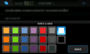
This dialog provides a finger-friendly, limited list of colors (a Tango-ish color palette) for the user to choose from. Especially useful when the color selection does not have to be "that special shade of green" but rather "a nice green" (for example to colorize categories or items).
There is also the possibility of an advanced mode for this dialog. This presents an additional "Advanced" button above "Select". When clicked, it presents the user with a regular HeColorDialog to pick an exact colour.
Example code and use cases:
- MaePad uses it for coloring the text of checklist items and for the color in sketches (src/ui/callbacks.c)
HeColorDialog
This dialog lets the user to select a color by selecting the intensity of the red, green, and blue channels. Also provides hex input/output of colours.
It may come in handy when a developer wants his/her users to be able to pick an exact shade of an exact colour in a finger-friendly way.
HeFontDialog
Lets the user choose a font together with a font size. It also offers bold and italic styles.
HeColorButton
On tapping the HeColorButton opens the HeColorDialog and lets the user select a color. This color is then displayed on the HeColorButton.
HeFontButton
On tapping the HeFontButton displays a HeFontDialog that lets the user select a font. The selected font is then displayed on the HeFontButton.


