Maemo.org logo contest submissions
(→jobelium) |
|||
| Line 96: | Line 96: | ||
=== Narbat === | === Narbat === | ||
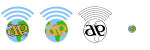
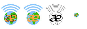
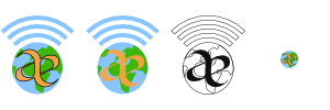
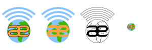
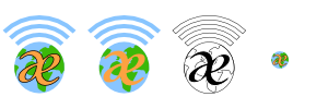
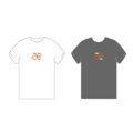
| - | Variations on a theme | + | Variations on a theme, using different fonts. The "ae" in "maemo" seems to stand out, so I wanted to incorporate that into the design. I also wanted to incorporate something about what the platform ''is'', hence the globe and wifi signal bars. These logos can be used with the full "maemo.org" spelled out, or just the globe and "ae" portion for when something narrower is needed. In the variations you can see what the logo looks like in monochrome, and how it looks as a 16x16 favicon. This logo uses only four colors (blue, green, orange, and black) with no gradients or dithering, which makes it easy to silk-screen onto a t-shirt. |
| - | <gallery widths=" | + | <gallery widths="300px" heights="100px" perrow="2"> |
| - | Image: | + | Image:Maemo_org_logo_contest_narbat_11.png|Font A |
| - | Image: | + | Image:Maemo_org_logo_contest_narbat_11v.png|Font A Variations |
| - | Image: | + | Image:Maemo_org_logo_contest_narbat_12.png|Font B |
| - | Image: | + | Image:Maemo_org_logo_contest_narbat_12v.png|Font B Variations |
| - | Image: | + | Image:Maemo_org_logo_contest_narbat_13.png|Font C |
| - | + | Image:Maemo_org_logo_contest_narbat_13v.png|Font C Variations | |
| - | + | Image:Maemo_org_logo_contest_narbat_14.png|Font D | |
| - | Image: | + | Image:Maemo_org_logo_contest_narbat_14v.png|Font D Variations |
| + | Image:Maemo_org_logo_contest_narbat_15.png|Font E | ||
| + | Image:Maemo_org_logo_contest_narbat_15v.png|Font E Variations | ||
</gallery> | </gallery> | ||
Revision as of 20:02, 20 June 2008
This page contains submissions for the maemo.org logo contest. The contest is now open! The closing date for entries is the 27th of July, 2008. For rules and submission guidelines, please see the contest page.
Contents |
Entries for maemo.org logo contest
attila
deadknight88
crawfordm
jobelium
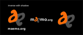
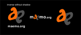
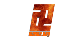
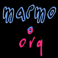
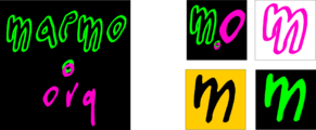
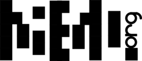
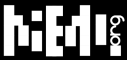
I did that with free font and a lot of fun ! :p J'ai fait ceala avec des fonts gratuit et beacoup de plaisir ! ;)
Maemo.org logo contest jobelium 6.png
|
|
Maemo.org logo contest jobelium 7.png
|
|
Maemo.org logo contest jobelium 10.png
|
Maemo.org logo contest jobelium 11.png
|
Maemo.org logo contest jobelium 12.png
|
Maemo.org logo contest jobelium 14.png
|
Maemo.org logo contest jobelium 15.png
|
Maemo.org logo contest jobelium 16.png
|
Maemo.org logo contest jobelium 17.png
|
Maemo.org logo contest jobelium 18.png
|
Maemo.org logo contest jobelium 19.png
|
Maemo.org logo contest jobelium 21.png
|
Maemo.org logo contest jobelium 23.png
|
|
Maemo.org logo contest jobelium 24.png
|
|
Maemo.org logo contest jobelium 27.png
|
rsperberg
GarethLWalt
baksiidaa
joeaguy
Narbat
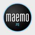
Variations on a theme, using different fonts. The "ae" in "maemo" seems to stand out, so I wanted to incorporate that into the design. I also wanted to incorporate something about what the platform is, hence the globe and wifi signal bars. These logos can be used with the full "maemo.org" spelled out, or just the globe and "ae" portion for when something narrower is needed. In the variations you can see what the logo looks like in monochrome, and how it looks as a 16x16 favicon. This logo uses only four colors (blue, green, orange, and black) with no gradients or dithering, which makes it easy to silk-screen onto a t-shirt.


