Maemo.org logo contest submissions
(→furrball) |
(→Entries for maemo.org logo contest) |
||
| Line 175: | Line 175: | ||
Image:Maemo.org_logo_contest_furrball1.png|I didn't actually set off to create something that looks so much like the contacts icon. This is just what came to mind when I thought of a collaborative process and these colors are what looked best after trying many combinations. | Image:Maemo.org_logo_contest_furrball1.png|I didn't actually set off to create something that looks so much like the contacts icon. This is just what came to mind when I thought of a collaborative process and these colors are what looked best after trying many combinations. | ||
Image:Maemo.org_logo_contest_furrball2.png|The blue and orange were my second choice so I included them. I felt the styled "e" should stay as a nod to the past, contrasted by the sharp angled font on the word "maemo" and coming together for something similar but unlike either in the "RG" of org. Perhaps I thought about it a bit too much :) | Image:Maemo.org_logo_contest_furrball2.png|The blue and orange were my second choice so I included them. I felt the styled "e" should stay as a nod to the past, contrasted by the sharp angled font on the word "maemo" and coming together for something similar but unlike either in the "RG" of org. Perhaps I thought about it a bit too much :) | ||
| + | </gallery> | ||
| + | |||
| + | === michael === | ||
| + | |||
| + | <gallery widths="300px" perrow="2"> | ||
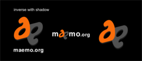
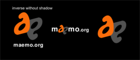
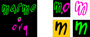
| + | Image:Maemo.org_logo_contest_michael-_01-.png|Maemo.org logo (white) | ||
| + | Image:Maemo.org_logo_contest_michael-_04-.png|Maemo.org logo (black) | ||
| + | </gallery> | ||
| + | |||
| + | <gallery widths="300px" perrow="2"> | ||
| + | Image:Maemo.org_logo_contest_michael-_02-.png|Logo 01 for favicons and t-shirts (white) | ||
| + | Image:Maemo.org_logo_contest_michael-_05-.png|Logo 01 for favicons and t-shirts (black) | ||
| + | </gallery> | ||
| + | |||
| + | <gallery widths="300px" perrow="2"> | ||
| + | Image:Maemo.org_logo_contest_michael-_03-.png|Logo 02 for favicons and t-shirts (white) | ||
| + | Image:Maemo.org_logo_contest_michael-_06-.png|Logo 02 for favicons and t-shirts (black) | ||
</gallery> | </gallery> | ||
Revision as of 09:51, 22 June 2008
This page contains submissions for the maemo.org logo contest. The contest is now open! The closing date for entries is the 27th of July, 2008. For rules and submission guidelines, please see the contest page.
Contents |
Entries for maemo.org logo contest
attila
deadknight88
crawfordm
thiercito
jobelium
I did that with free font and a lot of fun ! :p
J'ai fait cela avec des fonts gratuit et beacoup de plaisir ! ;)
Maemo.org logo contest jobelium 6.png
|
|
Maemo.org logo contest jobelium 7.png
|
|
Maemo.org logo contest jobelium 10.png
|
|
Maemo.org logo contest jobelium 11.png
|
Maemo.org logo contest jobelium 12.png
|
Maemo.org logo contest jobelium 14.png
|
|
Maemo.org logo contest jobelium 15.png
|
Maemo.org logo contest jobelium 16.png
|
Maemo.org logo contest jobelium 17.png
|
Maemo.org logo contest jobelium 18.png
|
Maemo.org logo contest jobelium 19.png
|
Maemo.org logo contest jobelium 21.png
|
Maemo.org logo contest jobelium 23.png
|
|
Maemo.org logo contest jobelium 24.png
|
|
Maemo.org logo contest jobelium 27.png
|
|
Maemo.org logo contest jobelium 28.png
|
|
Maemo.org logo contest jobelium 33.png
|
|
Maemo.org logo contest jobelium 35.png
|
|
Maemo.org logo contest jobelium 36.png
|
Maemo.org logo contest jobelium 37.png
|
rsperberg
GarethLWalt
baksiidaa
joeaguy
Narbat
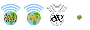
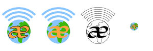
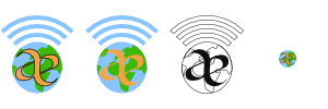
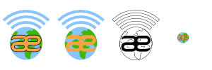
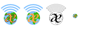
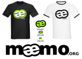
Variations on a theme, using different fonts. The "ae" in "maemo" seems to stand out, so I wanted to incorporate that into the design. I also wanted to incorporate something about what the platform is, hence the globe and wifi signal bars. These logos can be used with the full "maemo.org" spelled out, or just the globe and "ae" portion for when something narrower is needed. In the variations you can see what the logo looks like in monochrome, and how it looks as a 16x16 favicon. This logo uses only four colors (blue, green, orange, and black) with no gradients or dithering, which makes it easy to silk-screen onto a t-shirt.
jussi
calderov
chrismtn
convulted
rsuplido
Helvetica is used on all logos, my favorite font. All logos use orange-red as the background but can be anything. I hope you enjoy them. --Reggie 13:45, 21 June 2008 (UTC)
Morse Code: Simple and sharp. I added the morse code version of 'maemo' at the bottom to signify a classic sense of 'communication.' Click image for a sharper version of the logo. |
Zen: maemo is syllabicated and placed inside a Zen Enso symbol. Parts of 'maemo' and '.org' touch the circle. Circle is intentionally broken since "imperfection is an essential and inherent aspect of existence." Click image for a sharper version of the logo. |
Syntax 1: maemo.org is represented in a Syntax diagram. It somehow shows that maemo can be open source via the '.org' or can be bypassed, maybe to signify commercial apps. Click image for a sharper version of the logo. |
Syntax 2: maemo.org is represented in a Syntax diagram. A playful version to represent an infinite loop -- a never-ending maemo community discussion. Click image for a sharper version of the logo. |


