Maemo.org logo contest submissions
(→jobelium) |
(→Entries for maemo.org logo contest) |
||
| Line 126: | Line 126: | ||
<gallery widths="300px" heights="300px"> | <gallery widths="300px" heights="300px"> | ||
Image:Maemo_org_logo_contest_narbat_6.png|Size Comparisons. The 16x16 favicon doesn't have the wifi lines. The flat globe is used in all the above logos; a more spherical shading is also available (but is probably too busy for small areas). With the flat shading the logo only requires four colors: blue, green, orange, and black. Perfect for silk-screening onto a t-shirt! | Image:Maemo_org_logo_contest_narbat_6.png|Size Comparisons. The 16x16 favicon doesn't have the wifi lines. The flat globe is used in all the above logos; a more spherical shading is also available (but is probably too busy for small areas). With the flat shading the logo only requires four colors: blue, green, orange, and black. Perfect for silk-screening onto a t-shirt! | ||
| + | </gallery> | ||
| + | |||
| + | === jussi === | ||
| + | |||
| + | <gallery widths="500px" perrow="2"> | ||
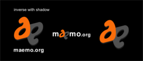
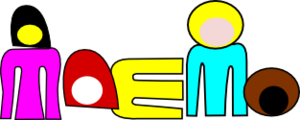
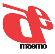
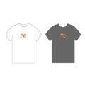
| + | Image:Maemo.org_logo_contest_jussi_-001-.png|The idea: The a and e ligature formed of dots signifies that the maemo is built on the collaborate effort of the community, and the mœbius loop / strip embedded in the ligature shows that there are infinite possibilities when you work together. | ||
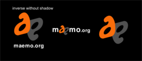
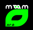
| + | Image:Maemo.org_logo_contest_jussi_-002-.png|Symbol only, to use for instance as favicon or on t-shirt print. | ||
| + | Image:Maemo.org_logo_contest_jussi_-003-.png|T-shirt examples | ||
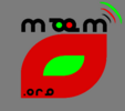
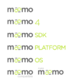
| + | Image:Maemo.org_logo_contest_jussi_-004-.png|I know this is a little above and beyond. I got a little carried away. These are ideas for implementation on the core maemo brand level, where colour can be used to signify the difference between the maemo os (green) and the maemo community (orange red). I suppose this is more up to Nokia. ;) | ||
</gallery> | </gallery> | ||
Revision as of 04:06, 20 June 2008
This page contains submissions for the maemo.org logo contest. The contest is now open! The closing date for entries is the 27th of July, 2008. For rules and submission guidelines, please see the contest page.
Contents |
Entries for maemo.org logo contest
attila
deadknight88
dzahariev
crawfordm
fredyrivera
jobelium
Maemo.org logo contest jobelium 6.png
|
||
Maemo.org logo contest jobelium 7.png
|
||
Maemo.org logo contest jobelium 10.png
|
Maemo.org logo contest jobelium 11.png
|
Maemo.org logo contest jobelium 12.png
|
Maemo.org logo contest jobelium 14.png
|
Maemo.org logo contest jobelium 15.png
|
|
Maemo.org logo contest jobelium 16.png
|
Maemo.org logo contest jobelium 17.png
|
Maemo.org logo contest jobelium 18.png
|
Maemo.org logo contest jobelium 19.png
|
Maemo.org logo contest jobelium 21.png
|
|
Maemo.org logo contest jobelium 23.png
|
Maemo.org logo contest jobelium 24.png
|
|
asgari
rsperberg
GarethLWalt
baksiidaa
joeaguy
Narbat
Variations on a theme. Same idea, using a stylized "ae" combination with a background of the globe, with wifi connection lines above. First is the full logo, then an abbreviated version for when the whole word isn't needed. Finally, each variation has a black-and-white variation.
Maemo org logo contest narbat 1.png
Font A |
Maemo org logo contest narbat 2.png
Font B |
Maemo org logo contest narbat 3.png
Font C |
Maemo org logo contest narbat 4.png
Font D |
Maemo org logo contest narbat 5.png
Font E |
Maemo org logo contest narbat 6.png
Size Comparisons. The 16x16 favicon doesn't have the wifi lines. The flat globe is used in all the above logos; a more spherical shading is also available (but is probably too busy for small areas). With the flat shading the logo only requires four colors: blue, green, orange, and black. Perfect for silk-screening onto a t-shirt! |


