Maemo.org logo contest submissions
This page contains submissions for the maemo.org logo contest. The contest is now open! The closing date for entries is the 27th of July, 2008. For rules and submission guidelines, please see the contest page.
Entries for maemo.org logo contest
attila
deadknight88
crawfordm
thiercito
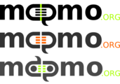
Less is More concept of the maemo.org logo. By adapting the letter "a" into the "e" we are suggesting the versatility and adaptiveness of the maemo platform
jobelium
I did that with free font and a lot of fun ! :p
edit: I have dumped a lot of ugly or non-original logo, to make place of a more conceptual logo and i regrouped then by theme.
J'ai fait cela avec des fonts gratuits et beaucoup de plaisir ! ;)
édit: j'ai jeter beaucoup de logos laids et pas assez original, pour faire place a des logo plus conceptuel et je l'ai est regroupés par thème.
ps: im a frenchspeaker sory for the inconveniant!
Maemo.org logo contest jobelium 7.png
|
Maemo.org logo contest jobelium 23.png
|
Maemo.org logo contest jobelium 24.png
|
Maemo.org logo contest jobelium 37.png
|
Maemo.org logo contest jobelium 15.png
a metalic logo version 1 |
Maemo.org logo contest jobelium 19.png
a metalic logo version 2 |
Maemo.org logo contest jobelium 10.png
a metalic logo version 4 |
|
Maemo.org logo contest jobelium 21.png
the first of the big AE square style |
|
Maemo.org logo contest jobelium 35.png
"big AE square style" straighted with color and a double o |
|
Maemo.org logo contest jobelium 46.png
|
|
rsperberg
GarethLWalt
baksiidaa
joeaguy
Narbat
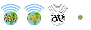
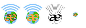
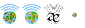
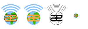
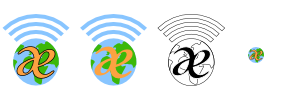
Variations on a theme, using different fonts. The "ae" in "maemo" seems to stand out, so I wanted to incorporate that into the design. I also wanted to incorporate something about what the platform is, hence the globe and wifi signal bars. These logos can be used with the full "maemo.org" spelled out, or just the globe and "ae" portion for when something narrower is needed. In the variations you can see what the logo looks like in monochrome, and how it looks as a 16x16 favicon. This logo uses only four colors (blue, green, orange, and black) with no gradients or dithering, which makes it easy to silk-screen onto a t-shirt.
jussi
Alternative version, solid moebius strip. Updated with some feedback from User:thiercito. |
|||
calderov
chrismtn
convulted
rsuplido
Helvetica is used on all logos, my favorite font. All logos use orange-red as the background but can be anything. I hope you enjoy them. --Reggie 13:45, 21 June 2008 (UTC)
Morse Code: Simple and sharp. I added the morse code version of 'maemo' at the bottom to signify a classic sense of 'communication.' Click image for a sharper version of the logo. |
Zen: maemo is syllabicated and placed inside a Zen Enso symbol. Parts of 'maemo' and '.org' touch the circle. Circle is intentionally broken since "imperfection is an essential and inherent aspect of existence." Click image for a sharper version of the logo. |
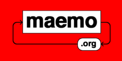
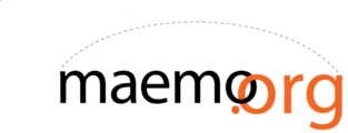
Syntax 1: maemo.org is represented in a Syntax diagram. It somehow shows that maemo can be open source via the '.org' or can be bypassed, maybe to signify commercial apps. Click image for a sharper version of the logo. |
Syntax 2: maemo.org is represented in a Syntax diagram. A playful version to represent an infinite loop -- a never-ending maemo community discussion. Click image for a sharper version of the logo. |
Cas
furrball
michael
femorandeira
angun33
wazd
Hello. I had some troubles with "Maemo.org" name so I used "Maemo-org" instead. Sorry for that.
Logo symbolizes I think all of the community aspects. A not childish but not too old (as our community is) human (as a main part of the community) spread his hands to all the people (we are welcome to everyone) and same time he breaks the borders and reaches the outer perspectives (same thing that we do in our open source world without any limitations) By the way "open source" is nicely integrated here too. His head shines bright with ideas in all ways like the sun. And if you'll place two logos near, people will look like they shaking hands. Logo can be anycoloured, but I prefer blue cause it's very calm for website design :) Whew, I'm done :)
rrainist
timsamoff
polyxena
blaxnux
mrunx
Variations on a Maemo "good vibes" theme...
- Typography used: "Domestic Manners", a Public Domain/GPL font by Dustismo
firebird8
Maemo.org logo contest firebird8 2.png
"The Community is always linked" |


